Young-geun Byun
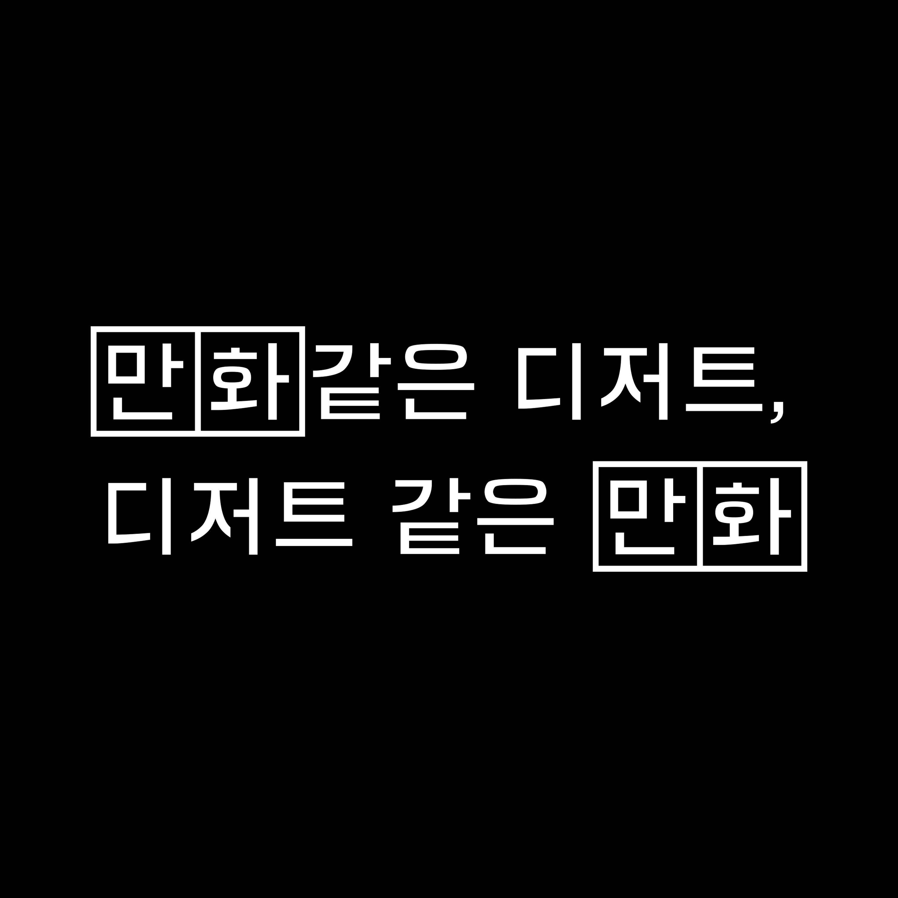
Cartoon-like dessert, dessert-like cartoon, 2021
Work Area: Exhibition Poster, Handout, etc.
Client: OA Seoul
Poster︎︎︎
594 × 841mm
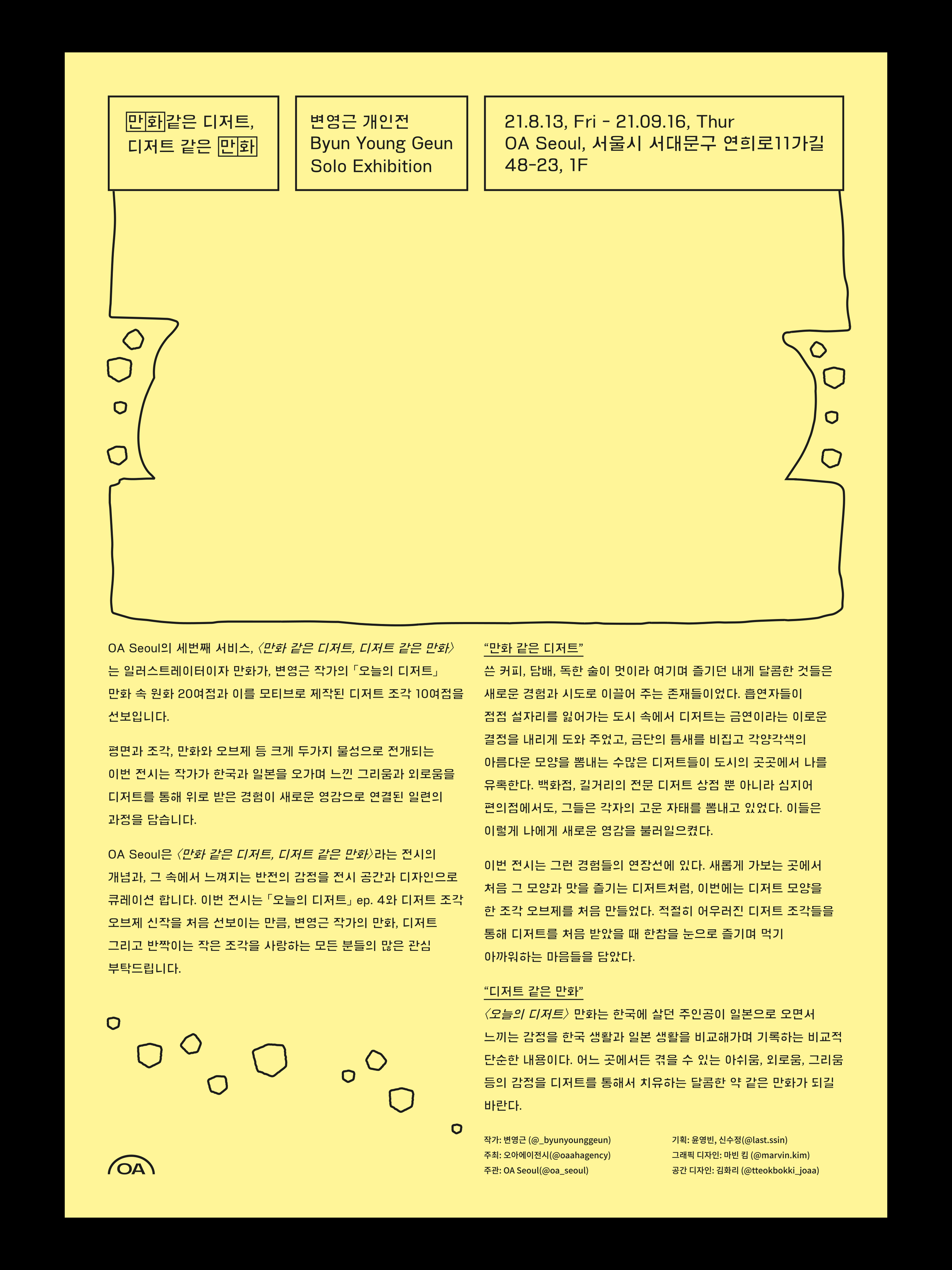
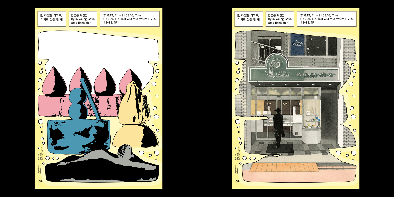
This is a solo exhibition to show the ceramic work of Young-geun Byun, who has mainly worked on cartoons and illustraions. The exhibition title consists of two sentences that change front and back. Dessert is the main in the previous sentence, and cartoon is the main in the latter sentence. I set the poster screen as a single screen with two different layers of sentences overlapping each other.
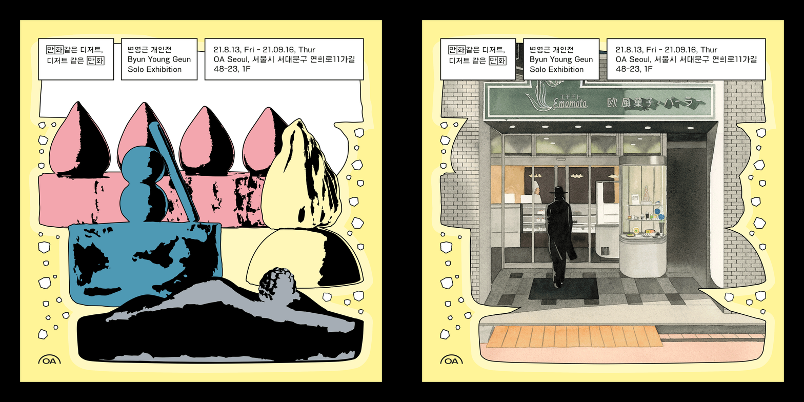
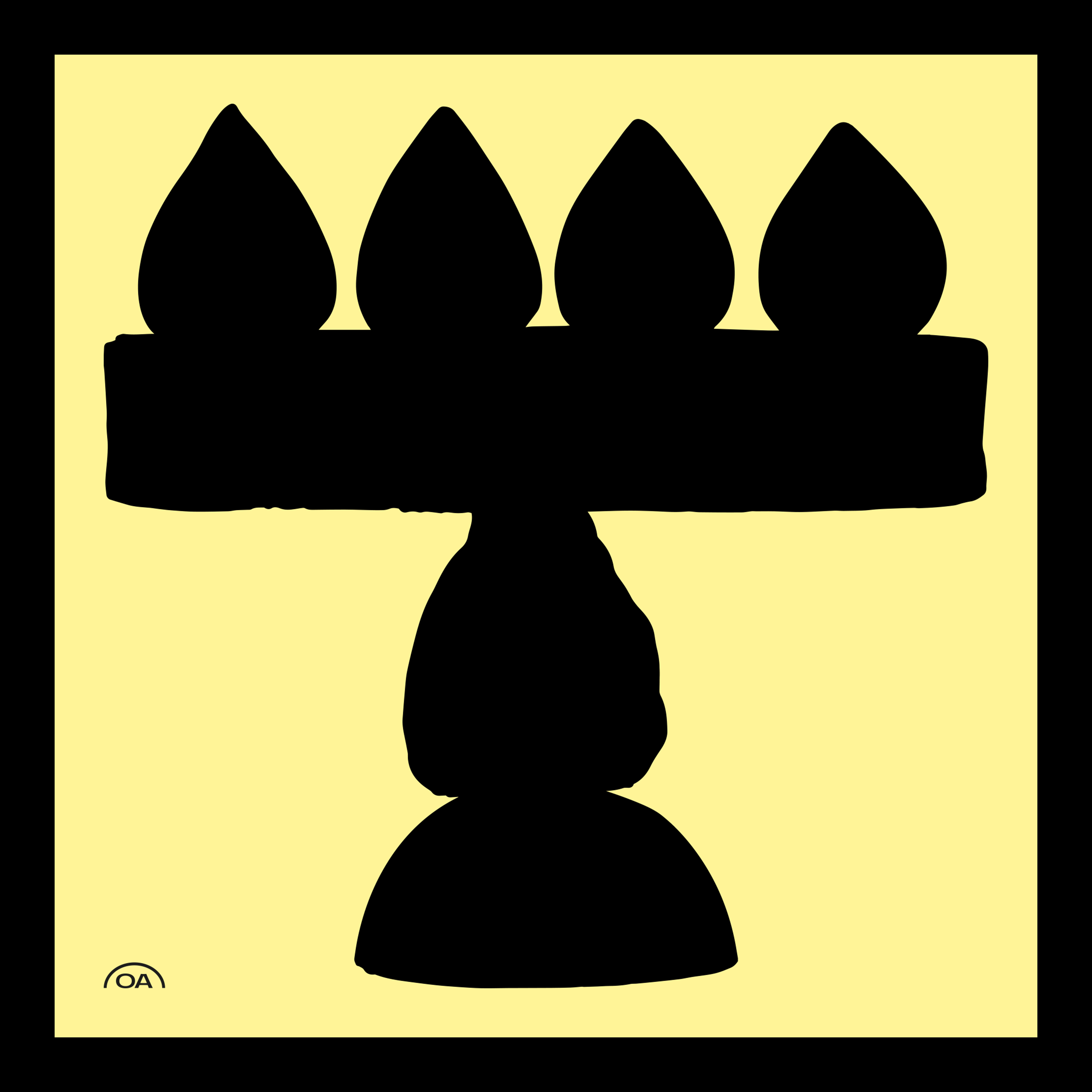
Different desserts, made like cartoons, come together to form one "Space (usually used in cartoons)". And the space is filled (as the latter sentence). Meanwhile the shape of the dessert at the top reminds us of a speech bubble from a cartoon. Empty speech bubble not only give desserts a sort of cartoon-like vitality, but also allow them to imagine the communication between dessert and cartoon images (front and back sentences).
Among the artist's numerous works, the selected image shows the main character walking into a dessert shop. There is an interesting point where the bricks on the outer wall of 'OA Seoul', where the exhibition is held, and the bricks of the store in the work intersect. Imagine that the door in the image is a passageway leading to the actual exhibition space. Aren't you curious about the world the artist will unfold?
Applications︎︎︎
Title Lettering
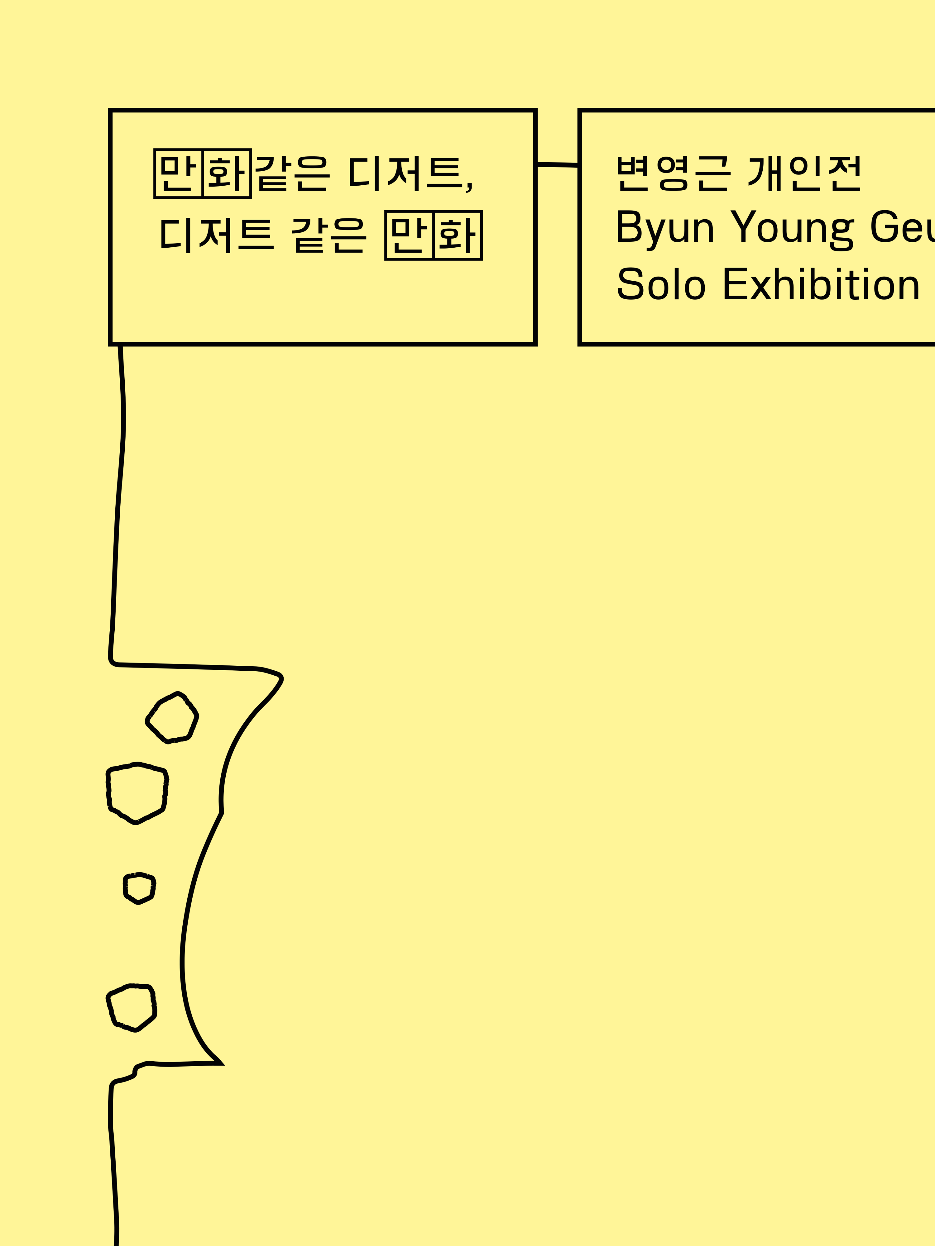
The main Hangul typeface is 'Gong Gan (which means space in korean)'. The 'Gong Gan' typeface is a typeface created based on a square space. In fact, artist Young-geun Byun often draws cartoons by dividing the cells very precisely, and the process of making this typeface is similar in many ways. The hard yet soft typeface goes very well with his work. In order to visually maximize the reversal of the front and back sentences, the word "comic" was directly enclosed with a square space.

Applications︎︎︎
Poster (Square Ver.) / Instagram Teaser Image