Photographer
YOON MI YEON, 2023
Work Area: Logotype, Name Card, Website
Client: Yoon Mi Yeon
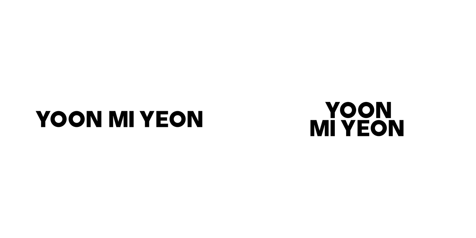
Logotype︎︎︎
Main / Sub Ver.
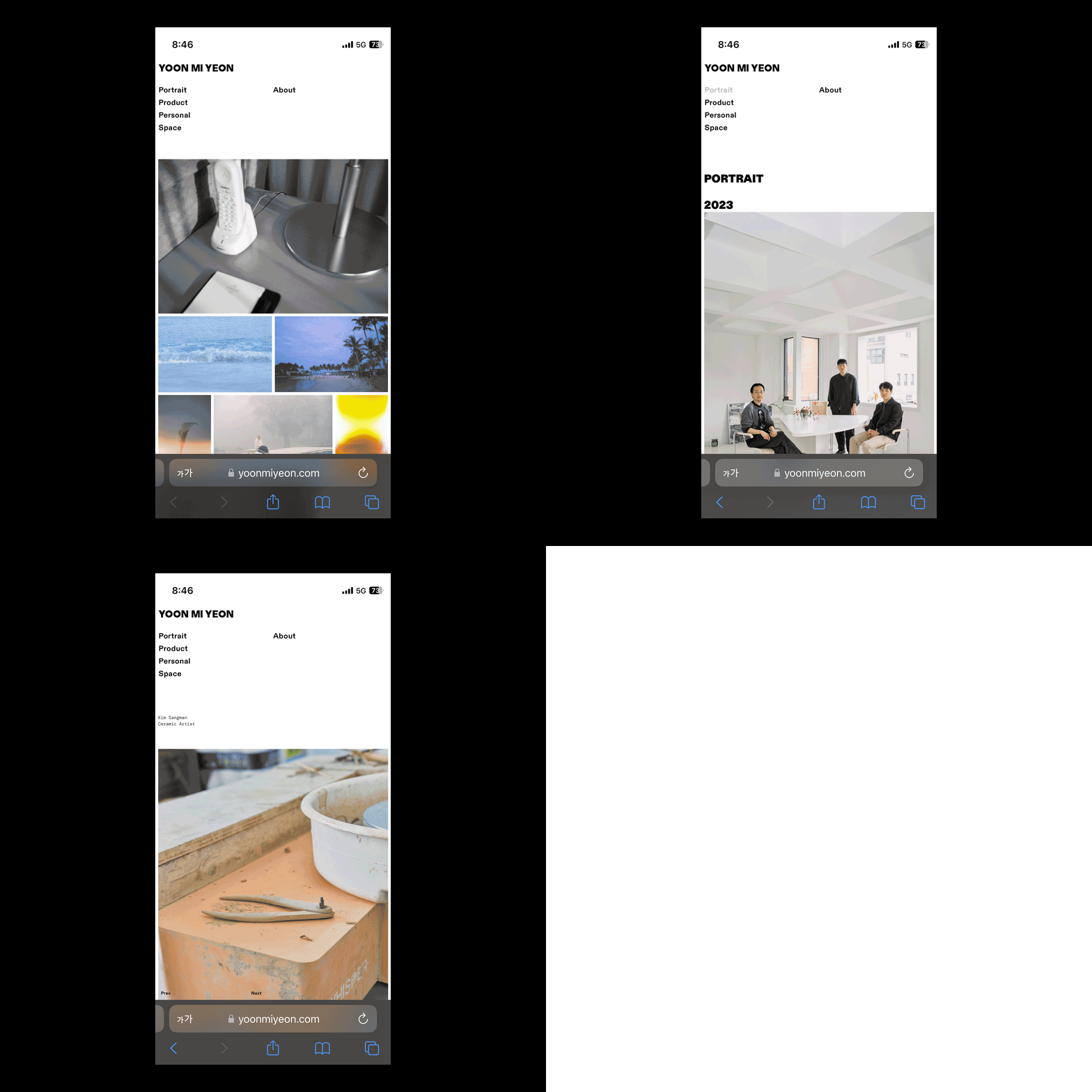
Photographer Mi Yeon Yoon uses both analog film cameras and digital cameras. As we can see, her name has two 'O's, which are reminiscent of the two different cameras she uses actually. I set this point as the main design concept and reflected it in the logo-type design. The two O's are completely circular, unlike the other letters. It reflects the shape of the camera lens, which stands out more in contrast to the other condensed letters. Meanwhile, she commissioned me to renew the website together. I designed it based on a neat layout to clearly divide various categories of photography work. I used bold typeface to maintain the design context of the logo-type. In particular, on the detailed page (subpage that goes in when you click on a photo), it is largely divided into two grids. This point is also the result of reflecting the 'information and image' of her work, similar to the design concept of 'two lenses'.

Applications︎︎︎
Website (Desktop / Mobile Ver.)
Applications︎︎︎
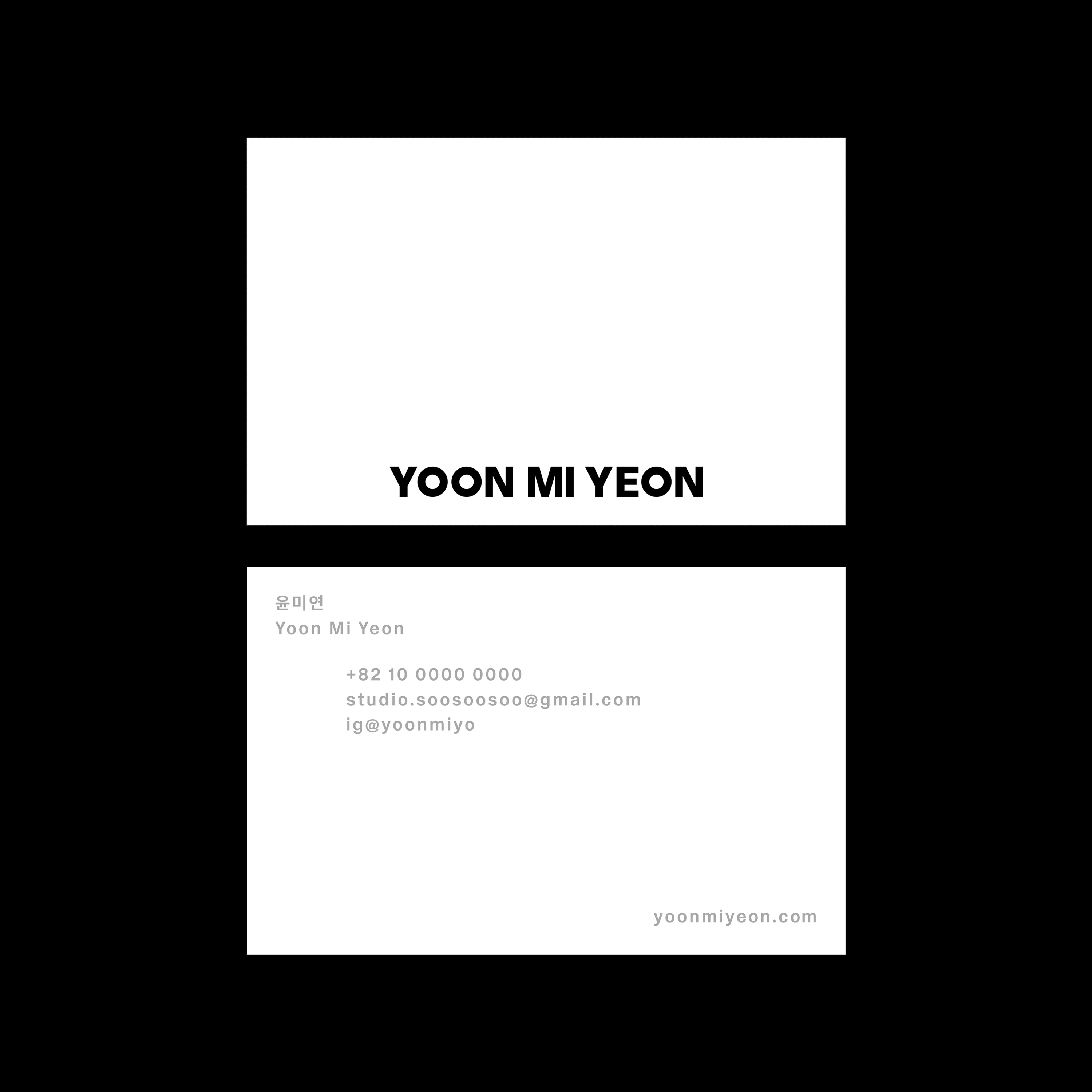
Business Card / 85 × 55mm
︎︎︎ Visit to Website