Cafe
SERO, 2019
Work Area: Branding(B.I, Printed Matter, Etc.)
Client: Cafe SERO
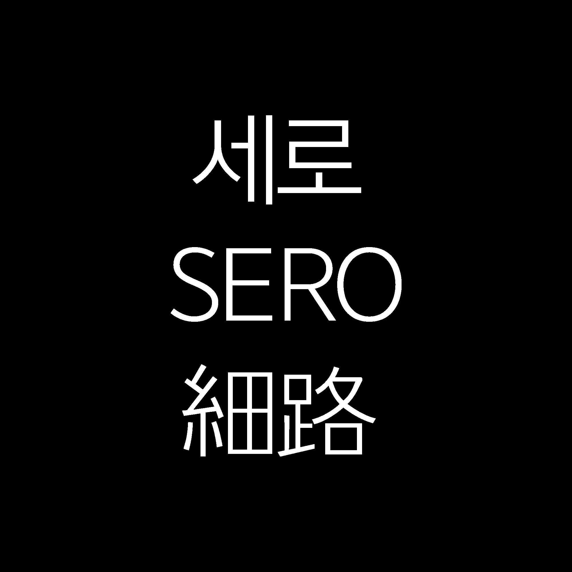
Logotype︎︎︎
Logo Motion
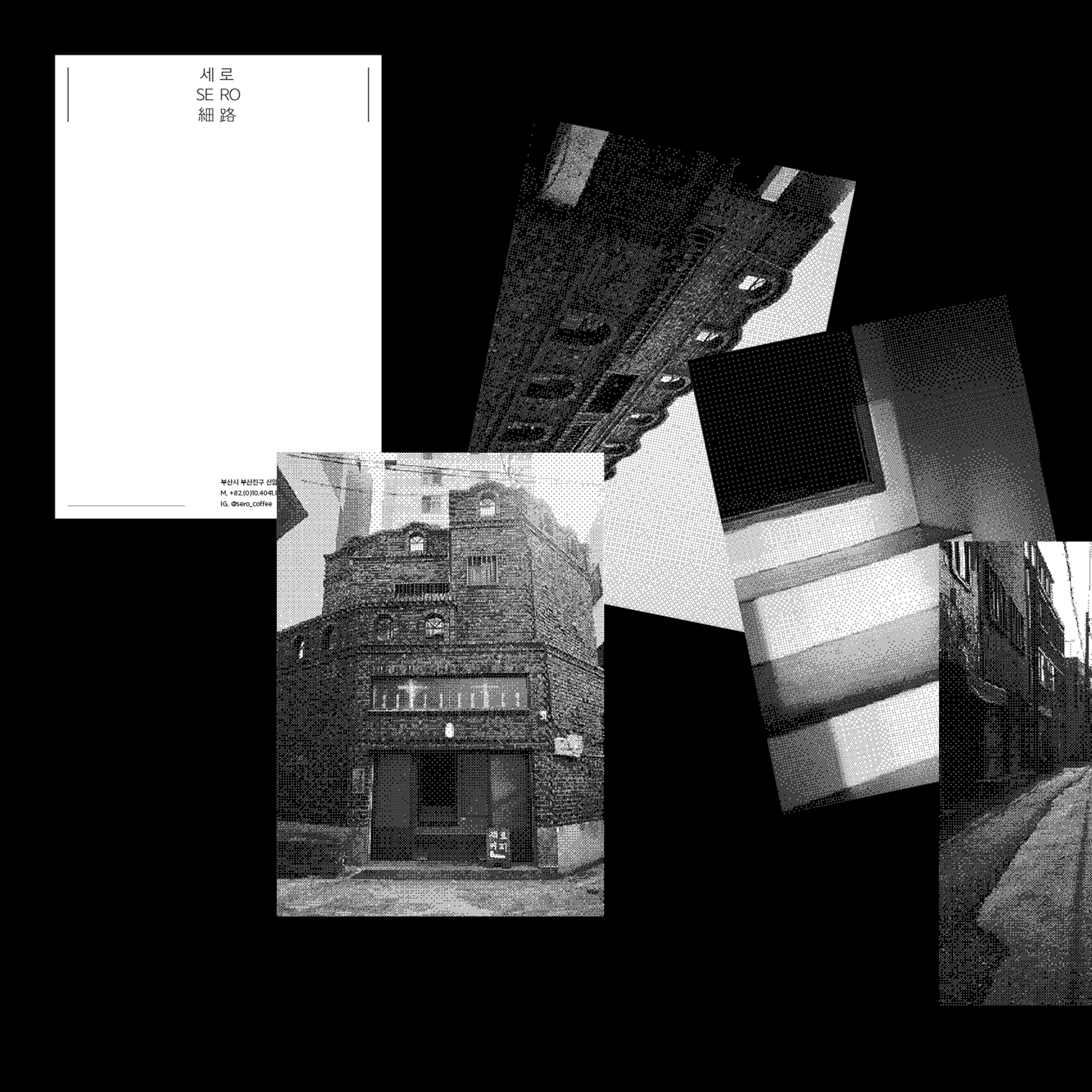
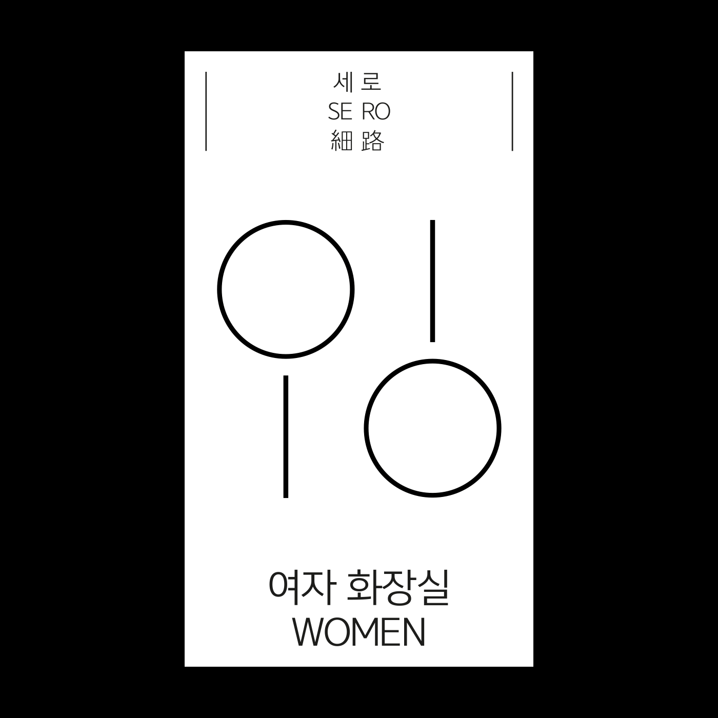
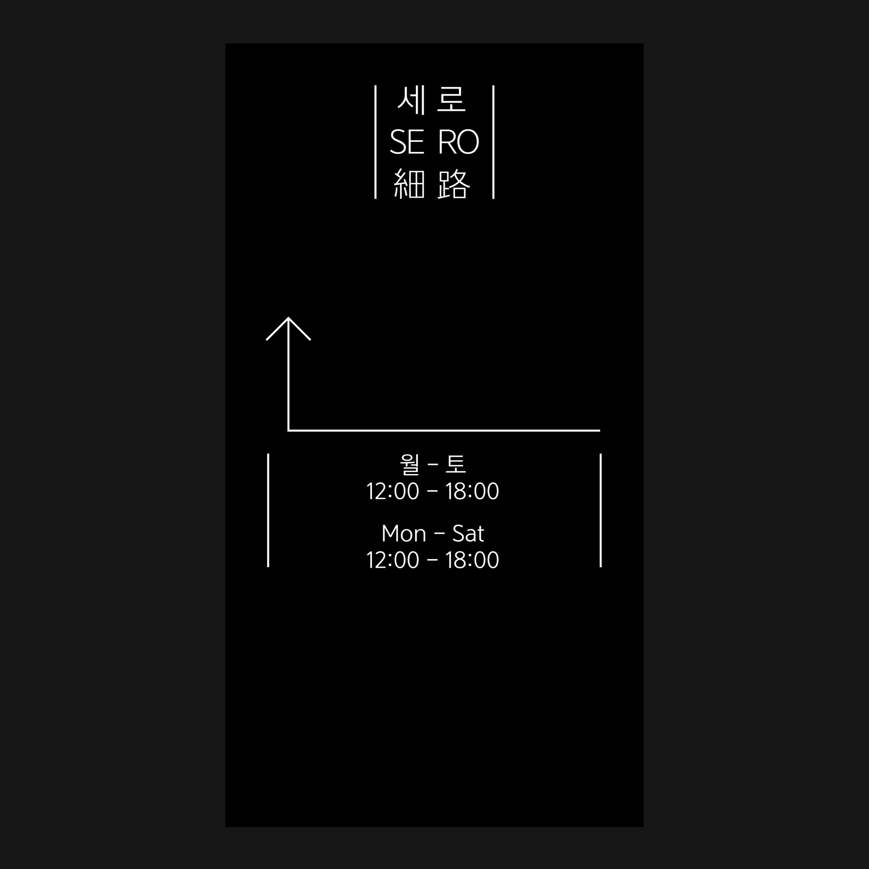
‘SERO’ means ‘narrow road’. The road captures the path of various people. For example, it could be the path that ‘SERO’ is trying to take the people struggling in their respective life. Meanwhile, I had to pass through a narrow alley when I visited the cafe. And when i enter a building with an unusual appearance, there is a long corridor lined up. These two physical spaces were enough to visualize the abstract meaning of 'SERO'.
The letters of B.I are spread out from the center to the outside. The space between the letters created afterwards visualizes a narrow alley and long corridor mentioned above.
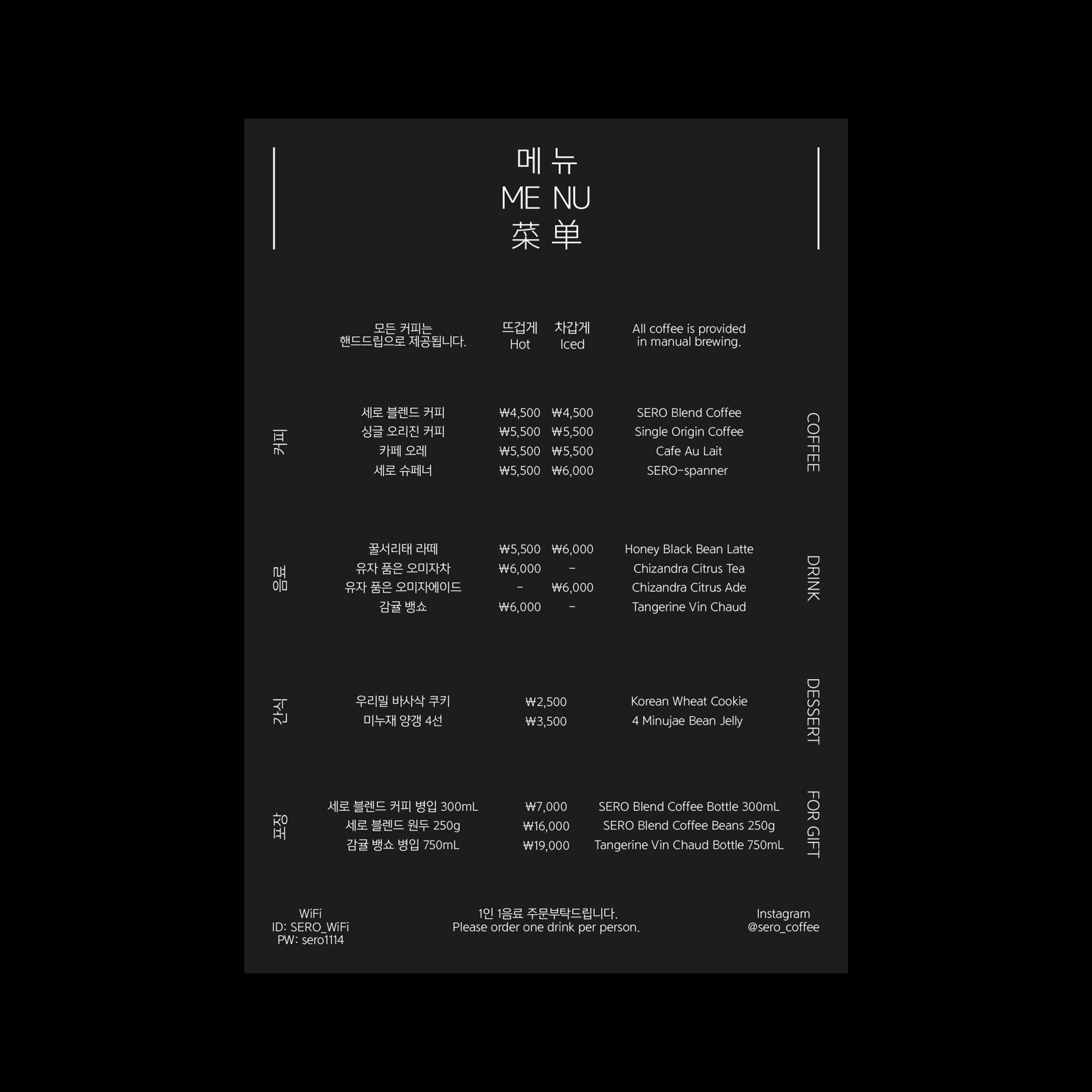
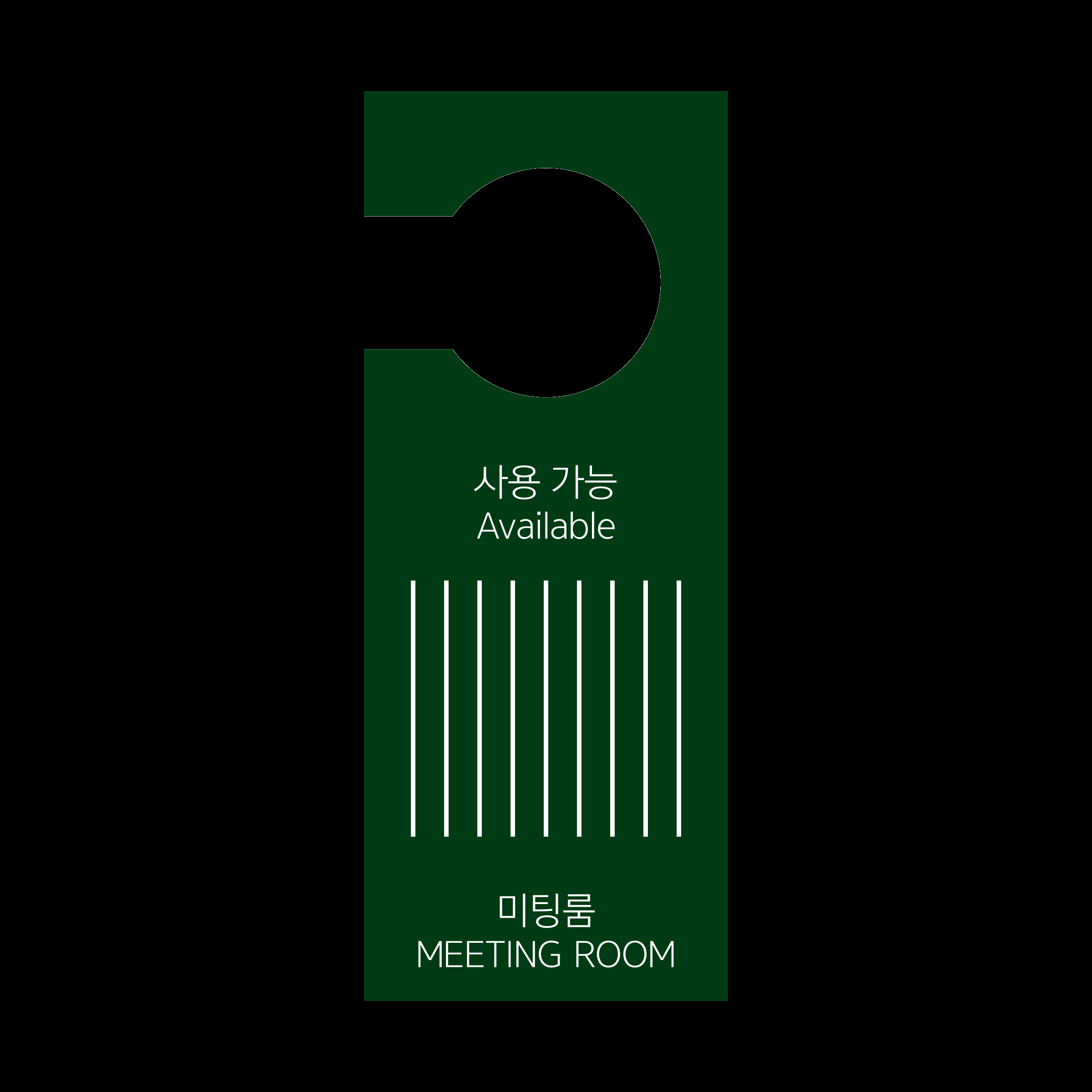
Applications︎︎︎
Menu Board, Signage / Dimensions Variable