Exhibition & Fair, GRIMDOSI
S#5: Waypoint, 2020
Work Area: Exhibition Identity(Poster, Printed Matters, Etc.)
Client: Oaah Agency, GRIMDOSI
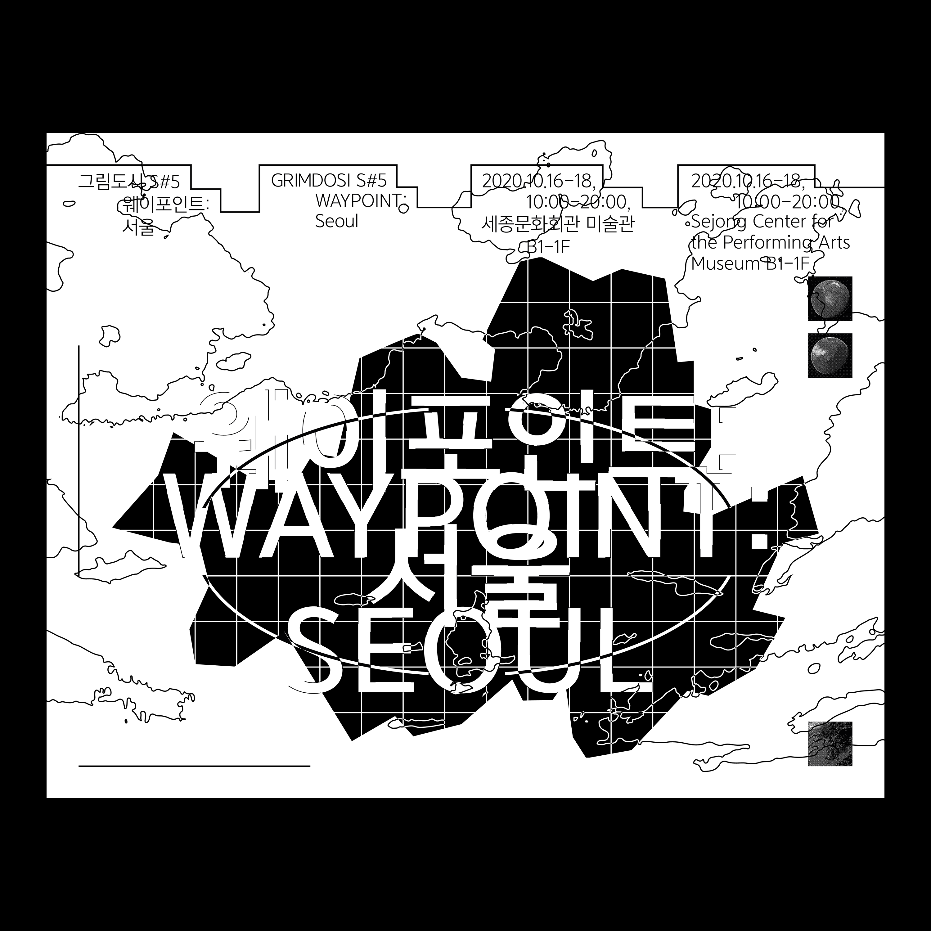
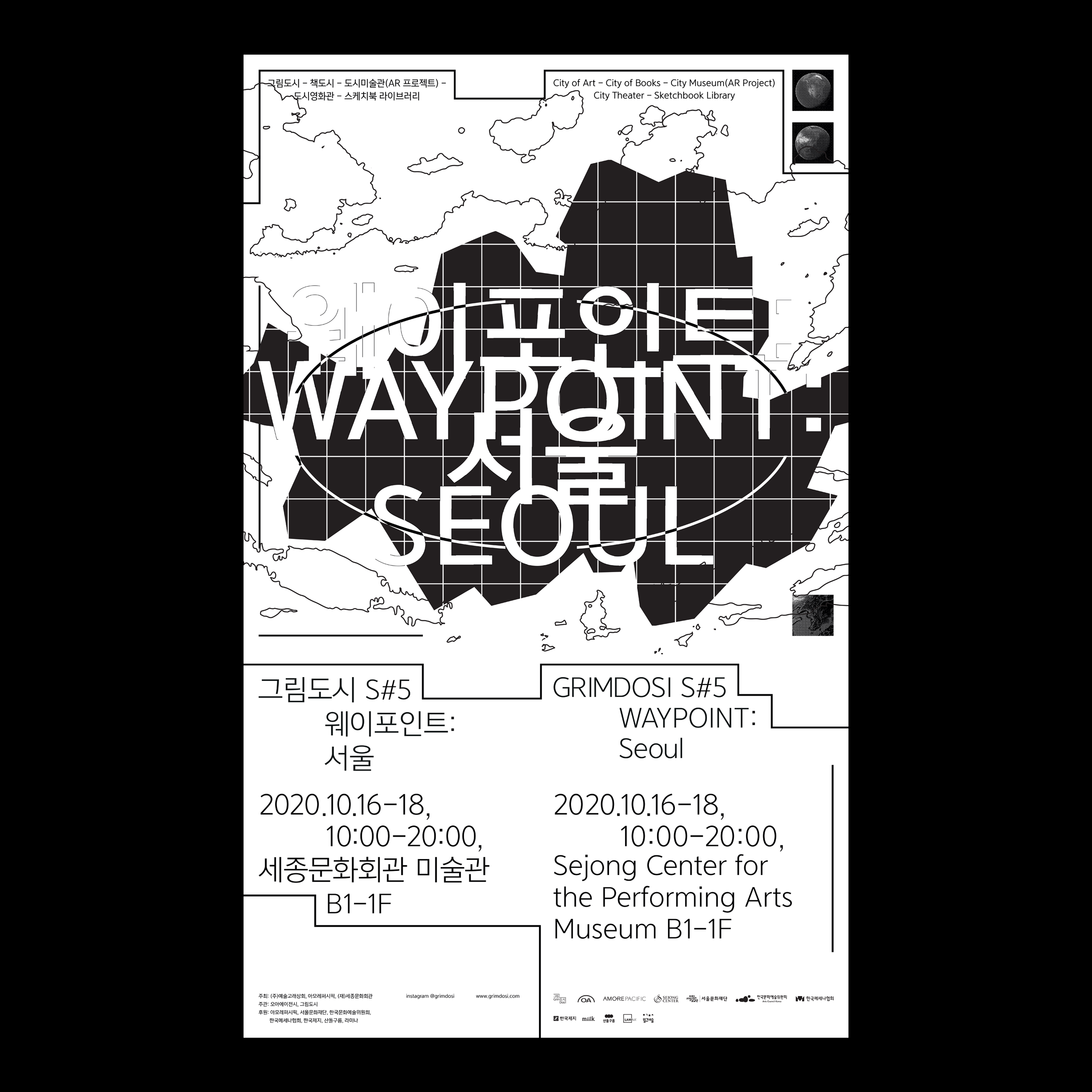
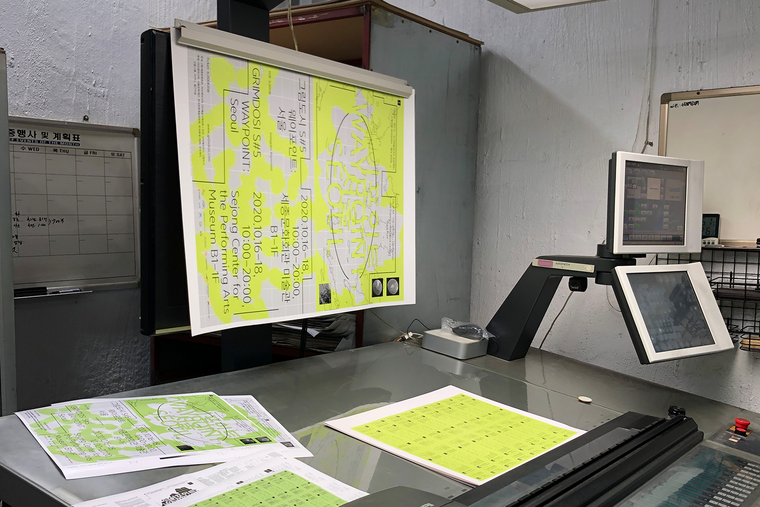
Poster︎︎︎
594 × 841mm
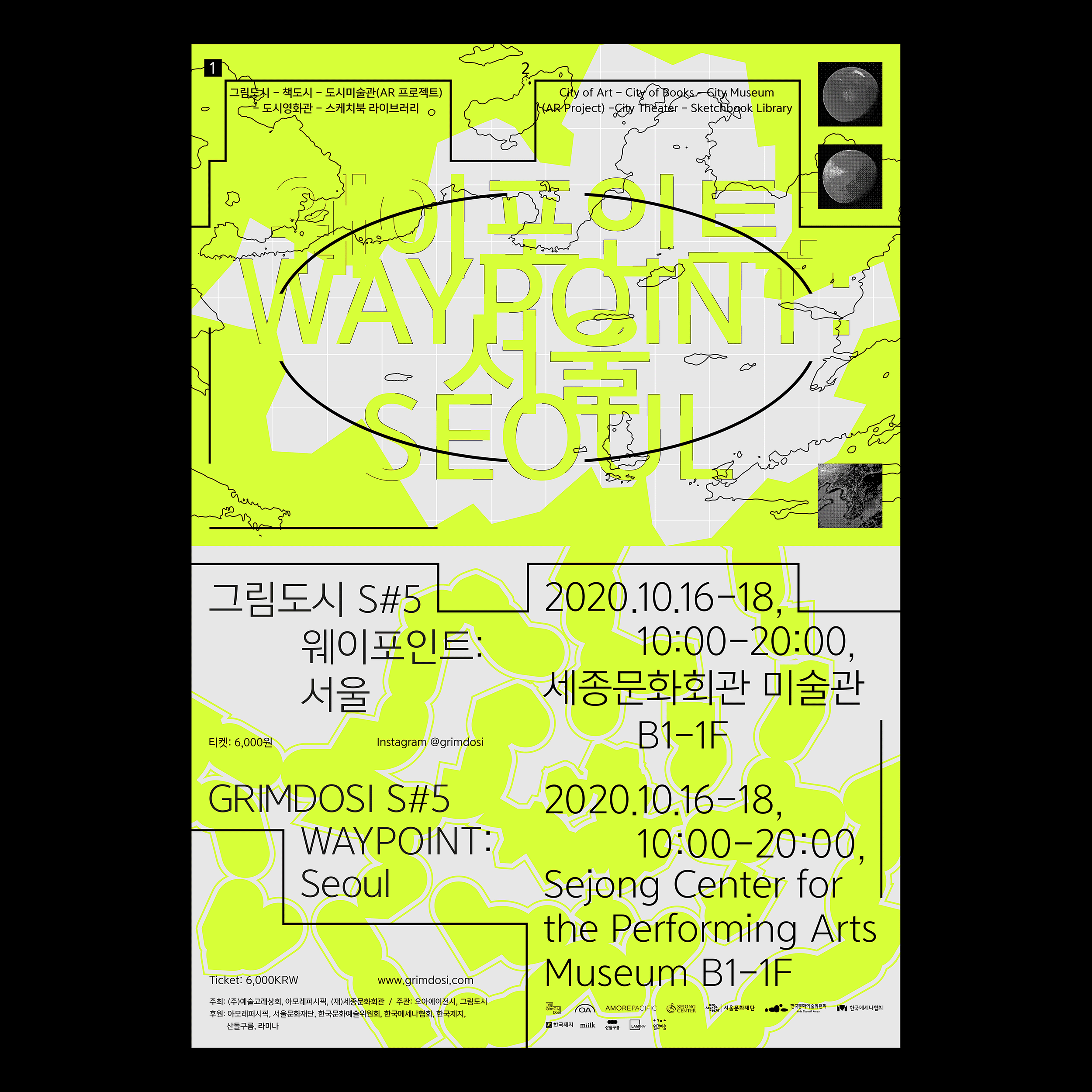
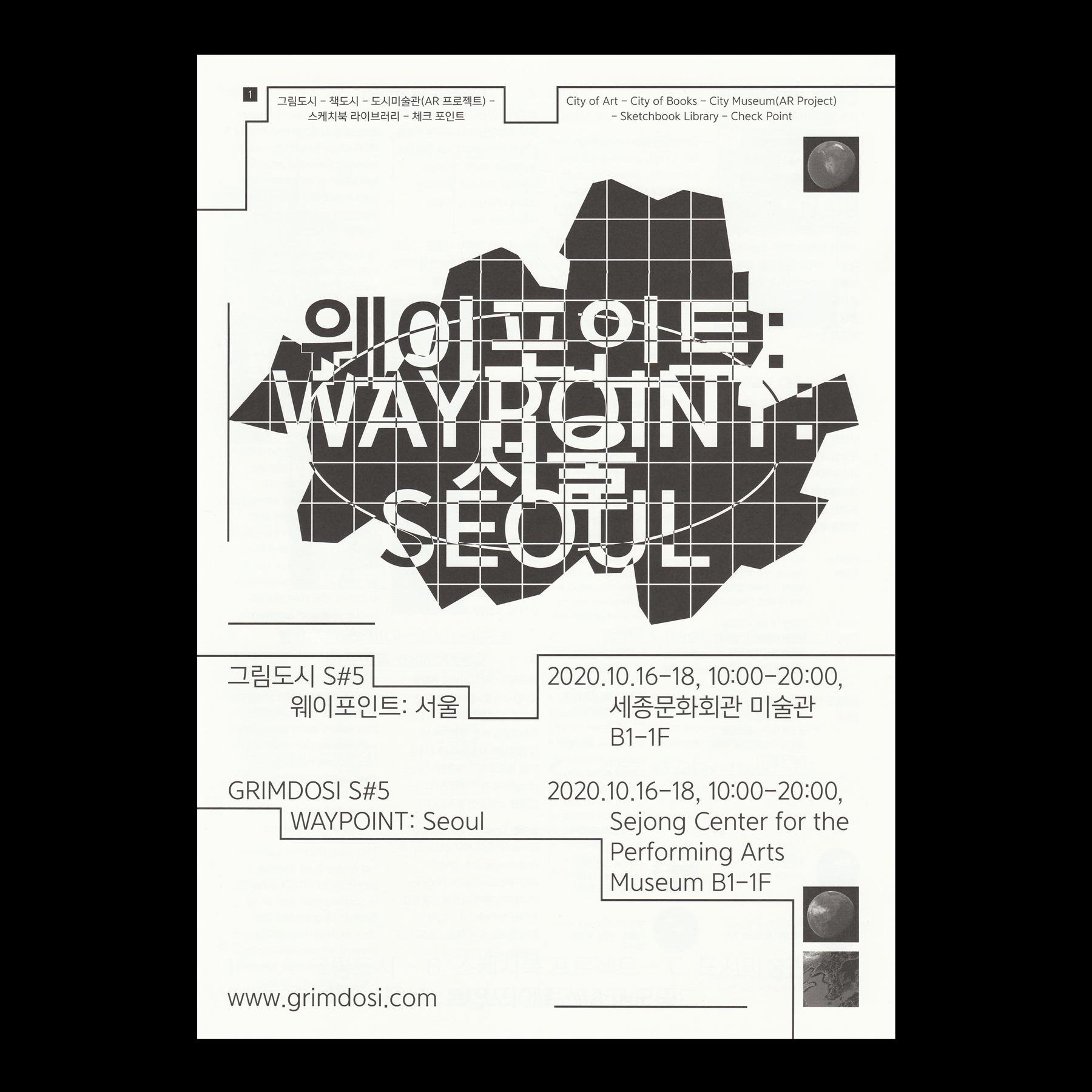
Grimdosi is an exhibition and fair for art, artists’ book and animation, aiming to flexibly introduce various genres of arts to the public. Amid this ever changing art scene, it provides a set of spatial and psychological environment that helps every participant be involved in an active communication on artworks. For this, Grimdosi selects a theme each year and curates it in the set of ‘City’.
2020 Grimdosi sets out its first journey to become a global art platform under this year’s theme “Connection.” Starting its first waypoint at Sejong Center located in Seoul, it will hold a serial popup exhibition in Gwanggyo Crita Gallery and finally overseas.
Text from official website
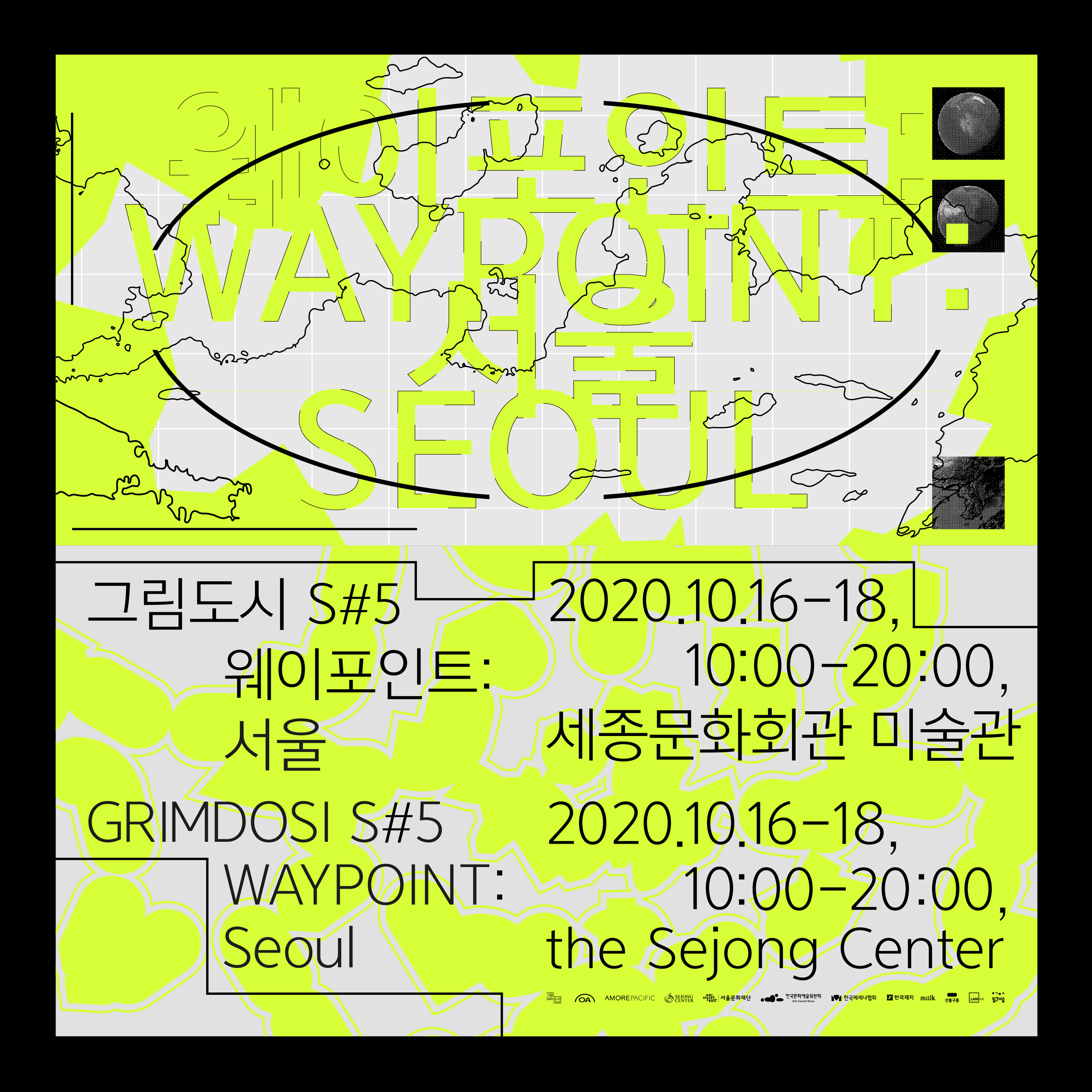
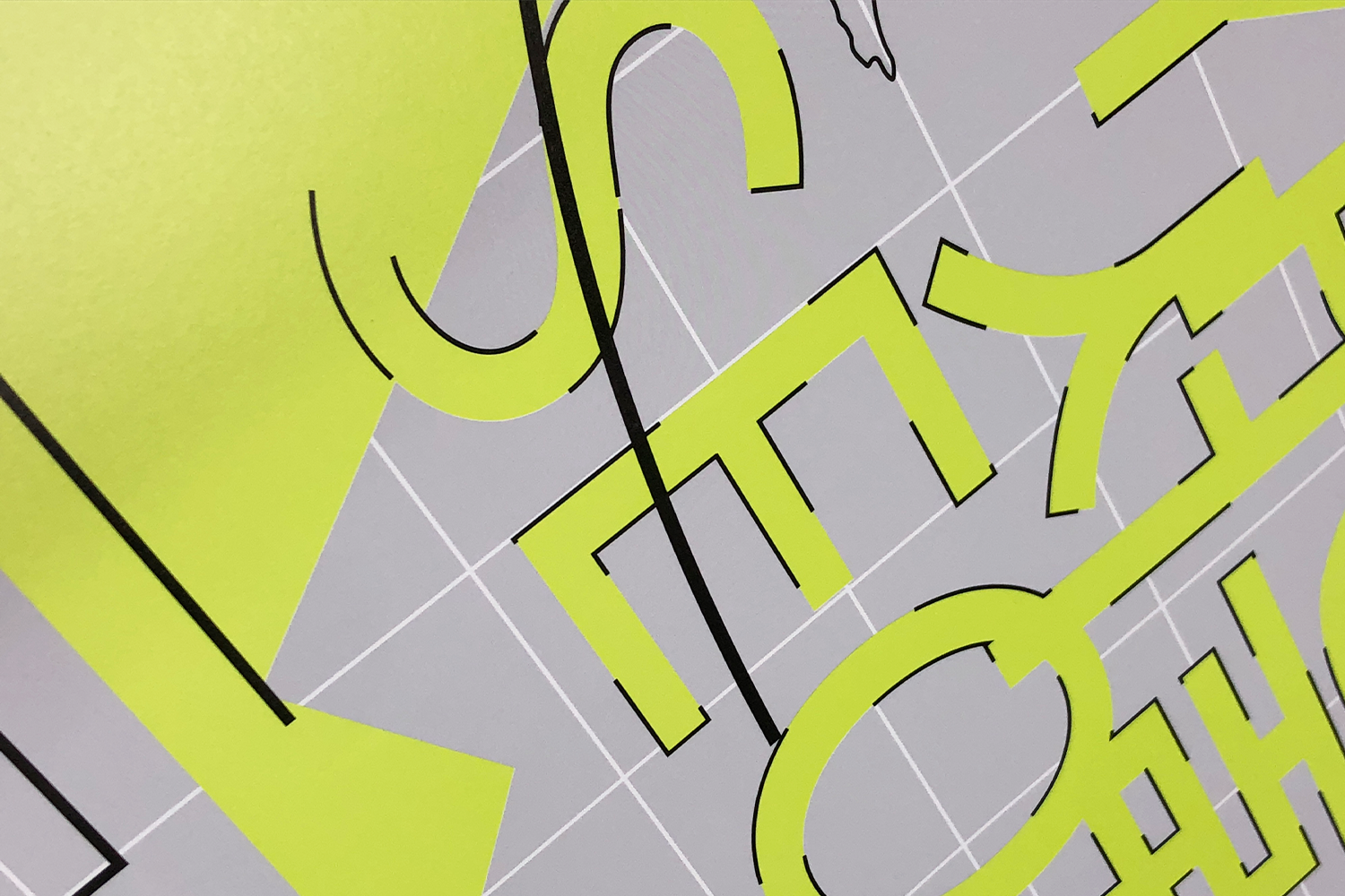
The main poster is divided into two section vertically. In interpreting process for the subject of the exhibition, I was focus on the'physical connection' at first, and ‘the Topography of Seoul and Gwanggyo' that can intuitively reveal the subject was used for grpahic. I placed this on each section of poster. Later, I thought about the'non-physical aspect of connection'. It can be a connection between the participants and the audience.
In order to visualize these points, the terrain that was placed at the top was placed at the bottom, while the shape of it was changed abstractly to capture the various points of the subject.

Applications︎︎︎
Poster (Square Ver.)

Applications︎︎︎
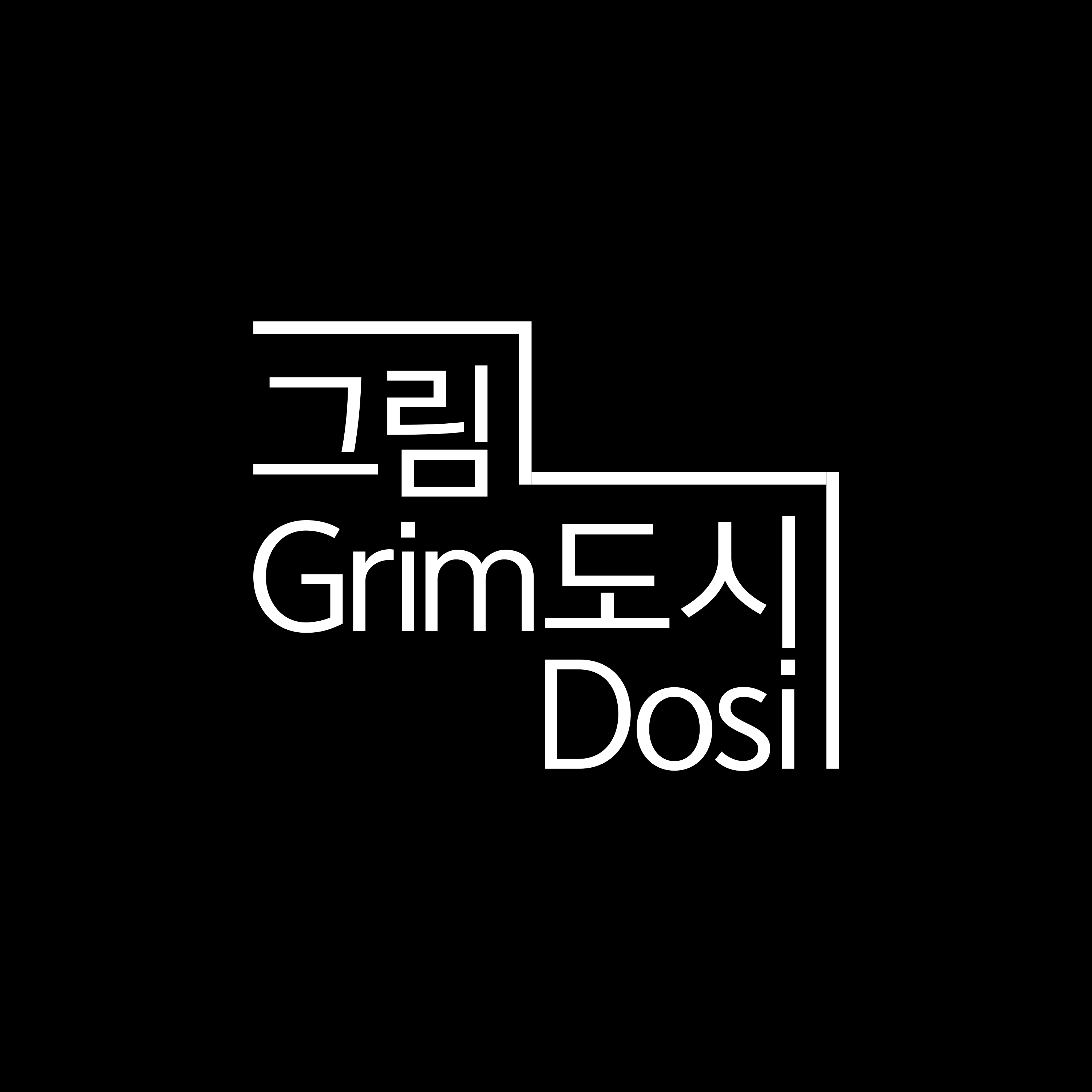
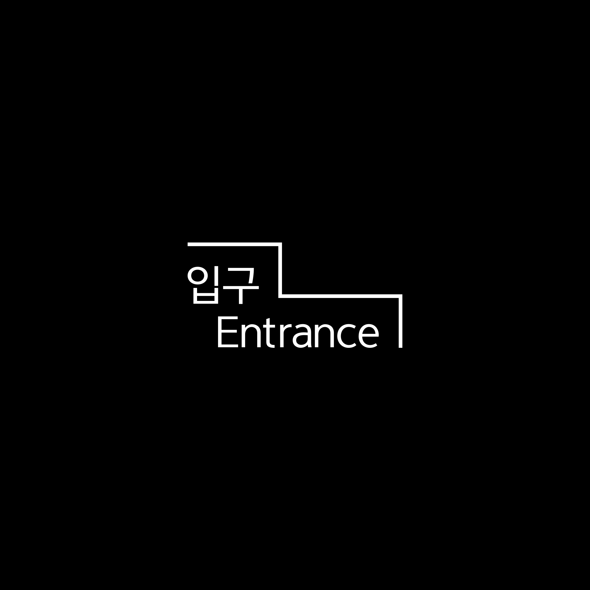
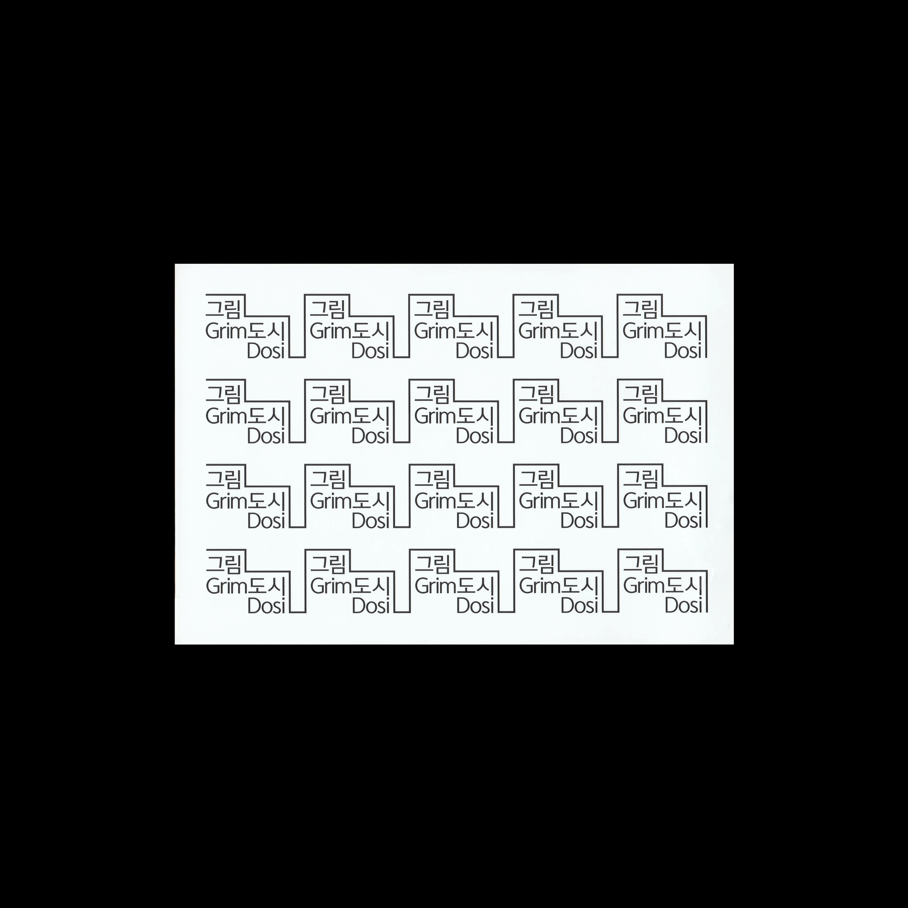
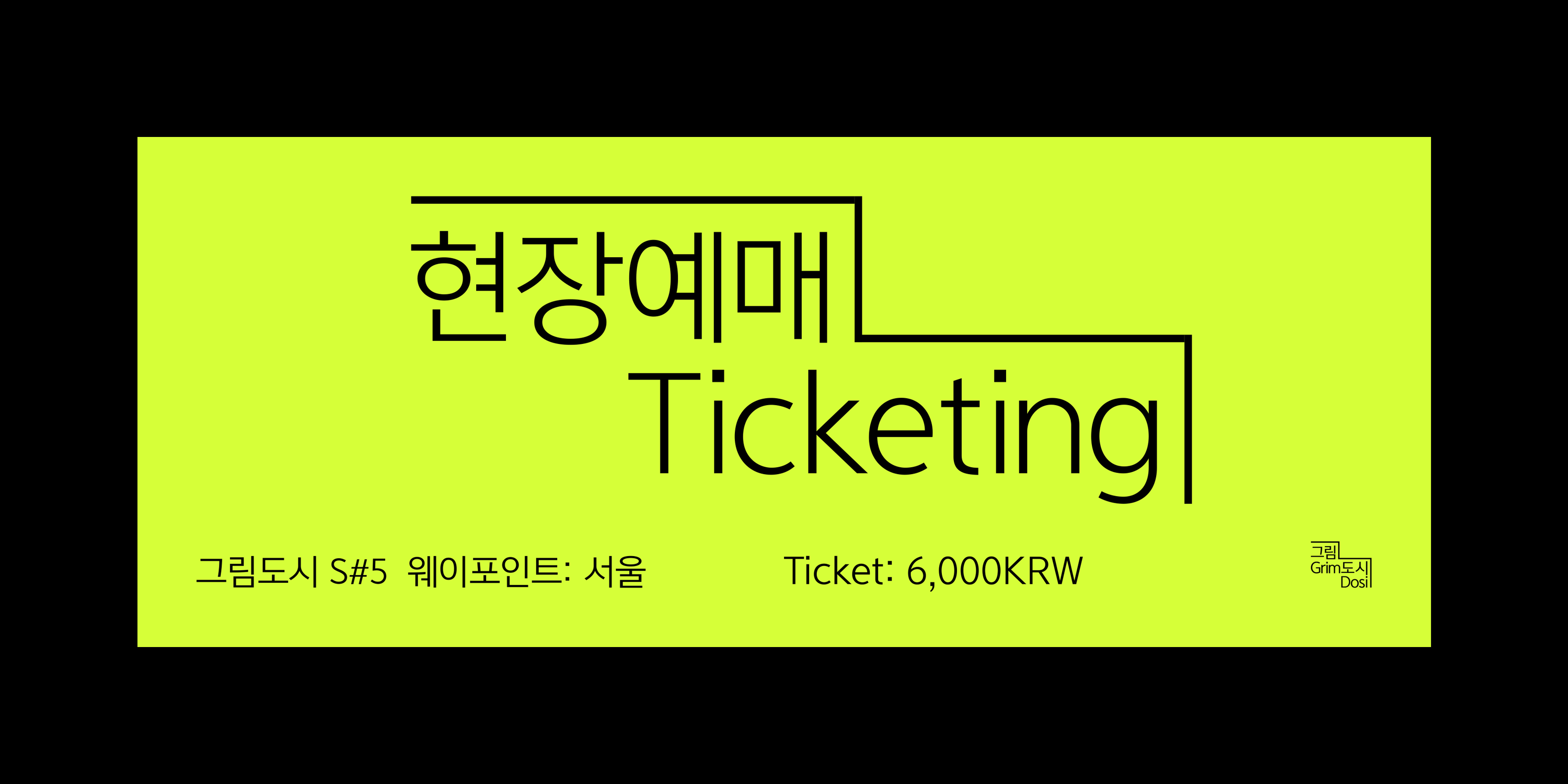
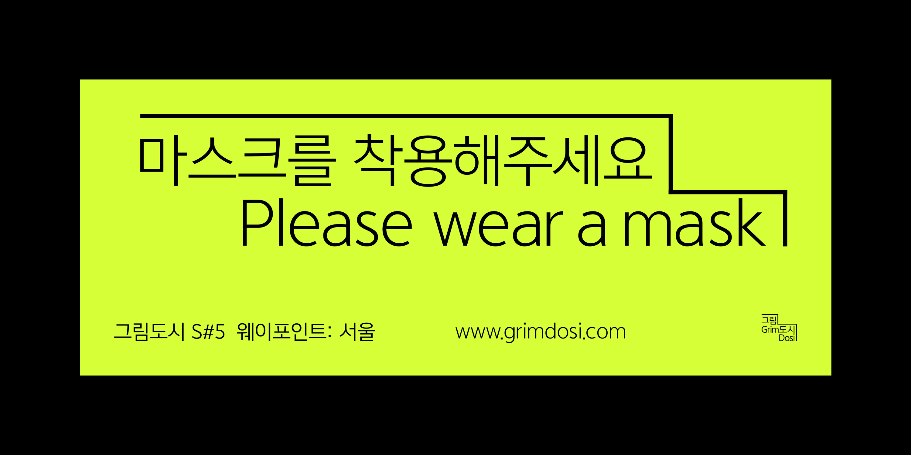
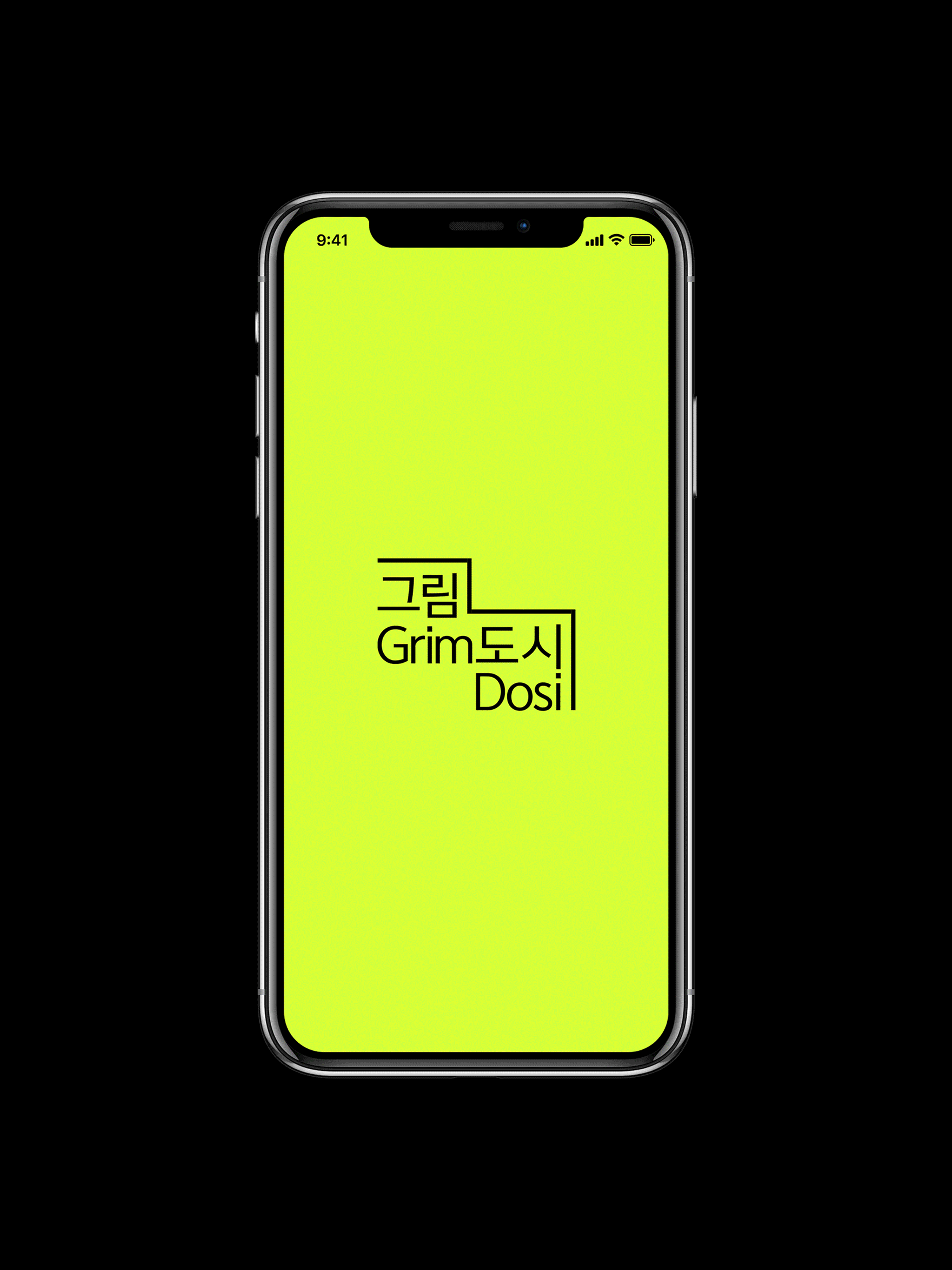
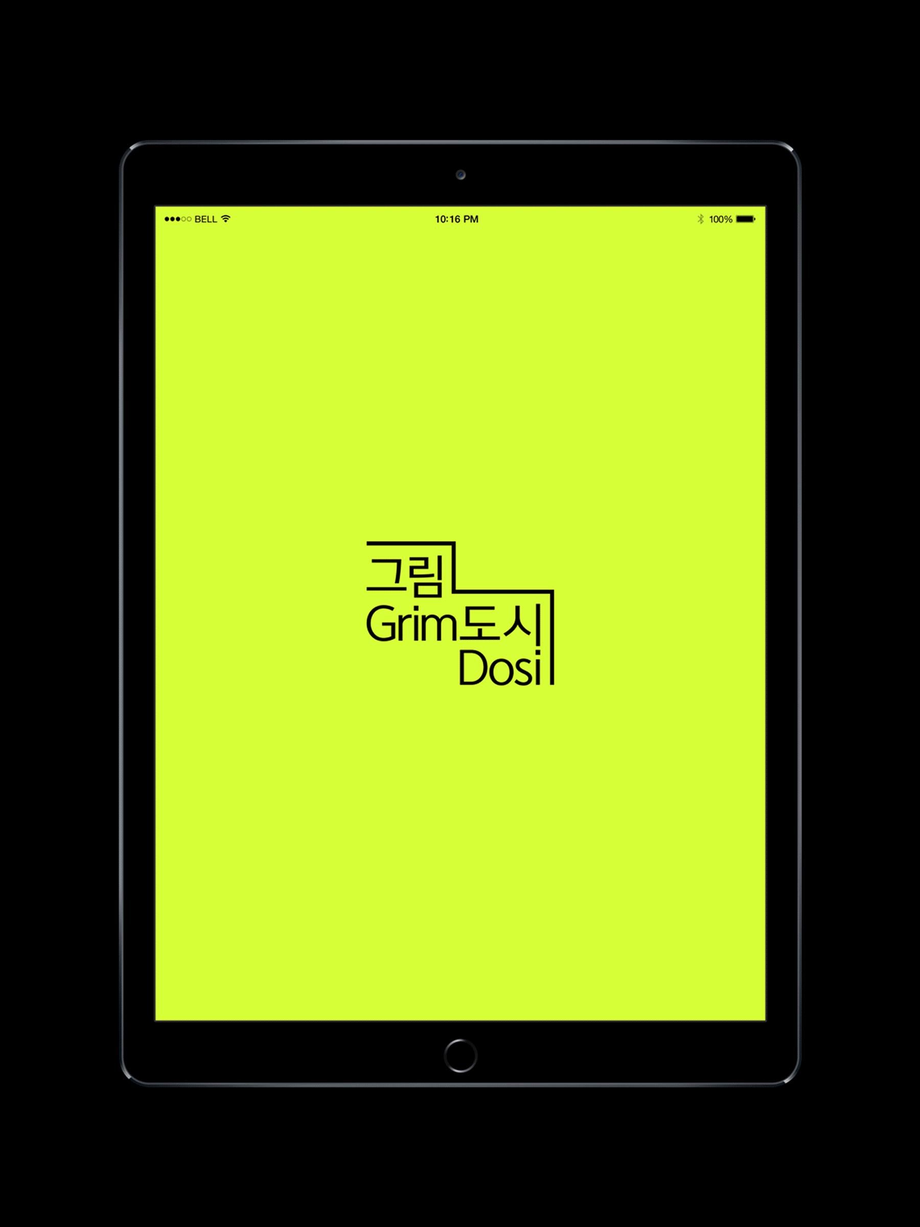
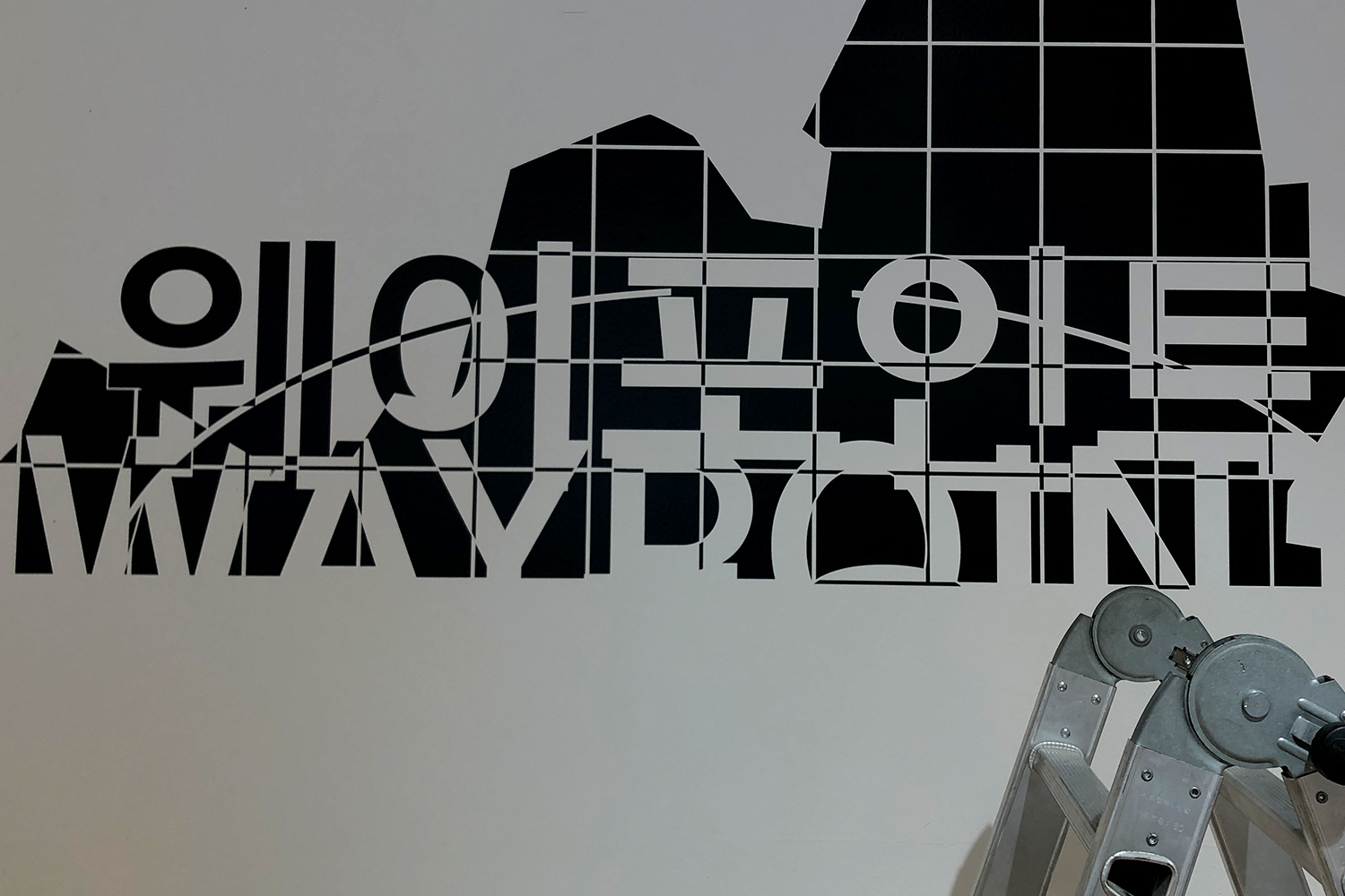
Exhibition Logotype
In this year, the theme of exhibition is “Connection”. When I thought about the word 'Grimdosi(picture city)' & connection, I was reminded of a square framed canvas or endless lines of buildings(especially in Seoul). Line that can be seen on the edge of the connected building just looks like the theme of this year’s Grimdosi, “Expansion”. So, I decided to use this identity(line) for the exhibition and identity can be linked to each other horizontally, vertically, infinitely.
Applications︎︎︎
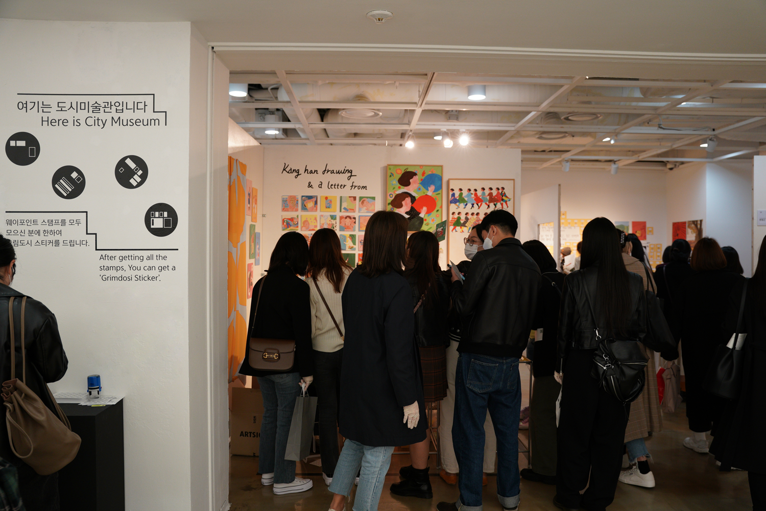
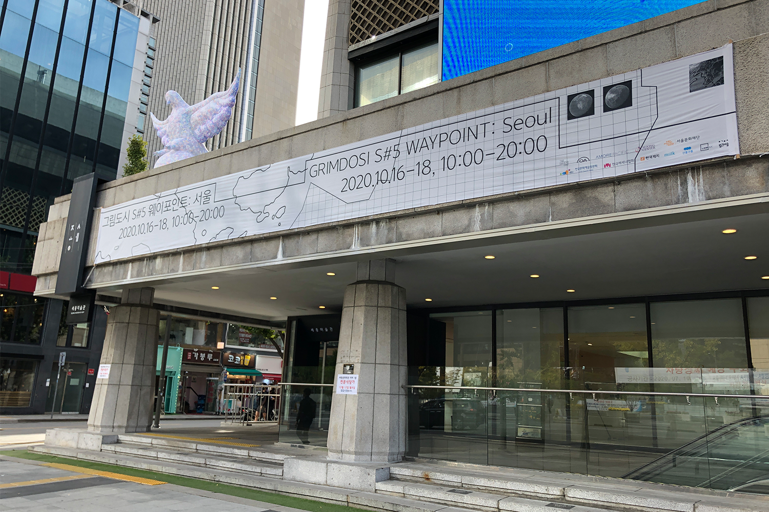
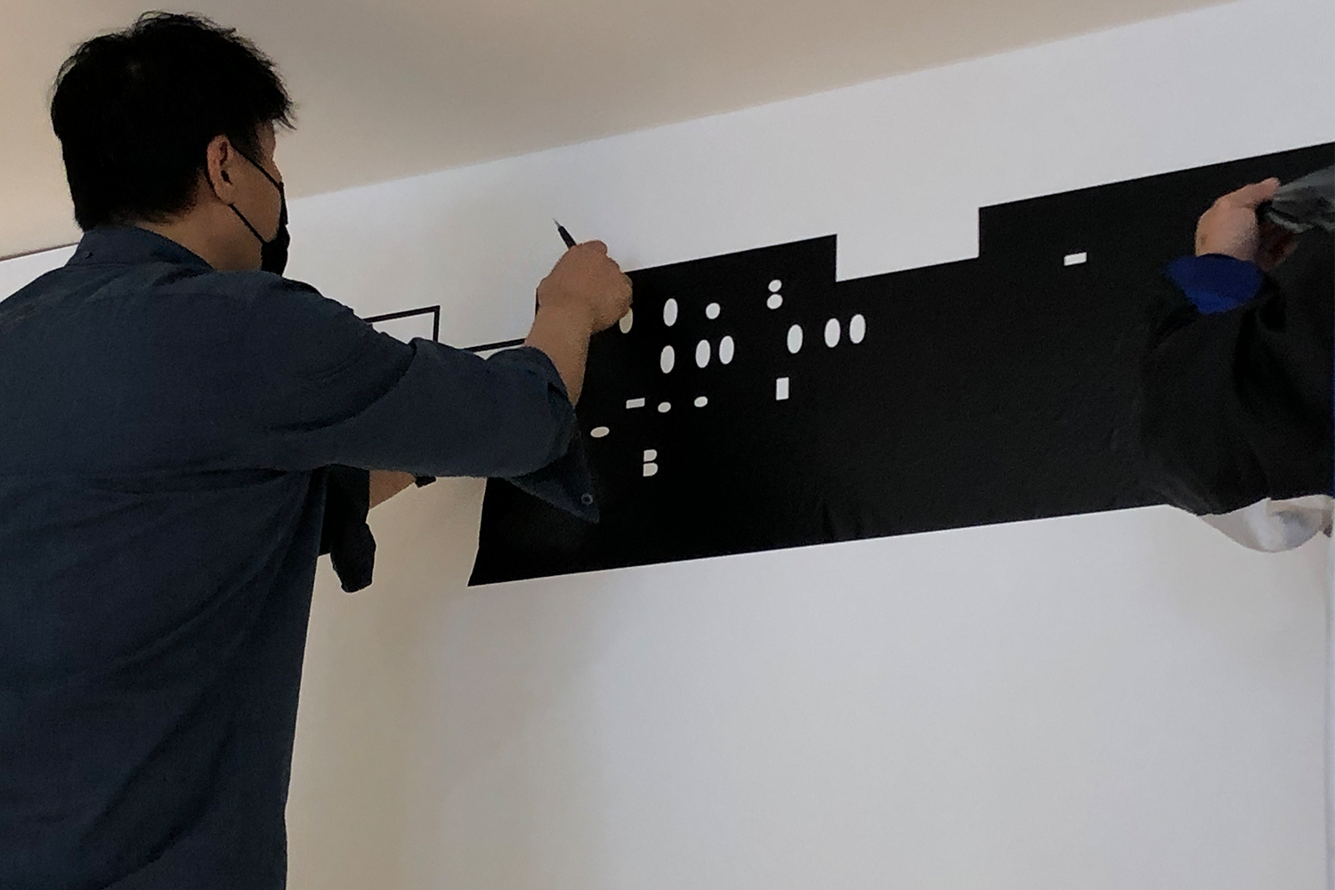
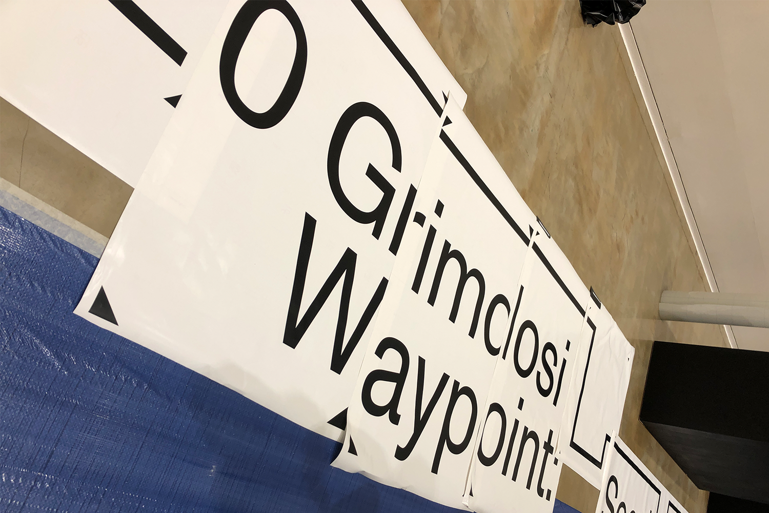
Signage
Applications︎︎︎
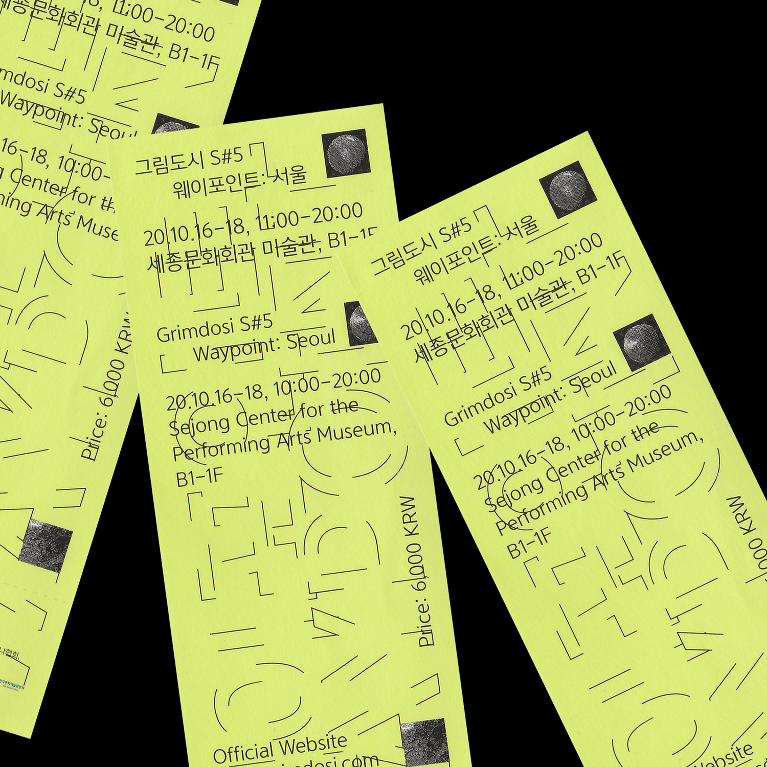
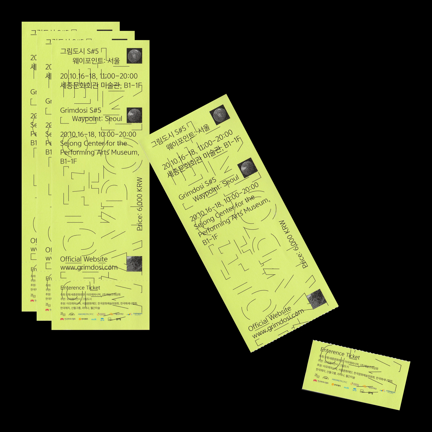
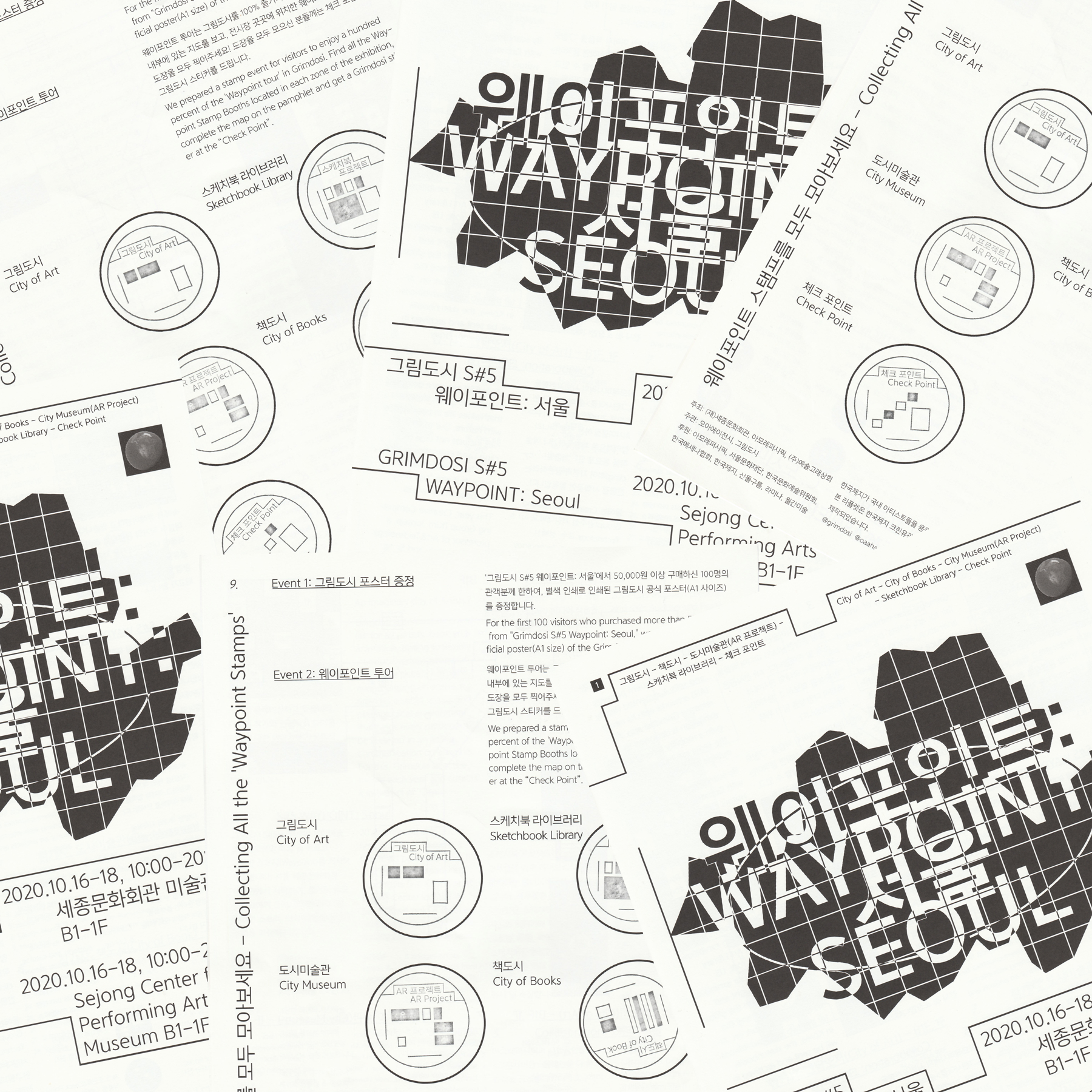
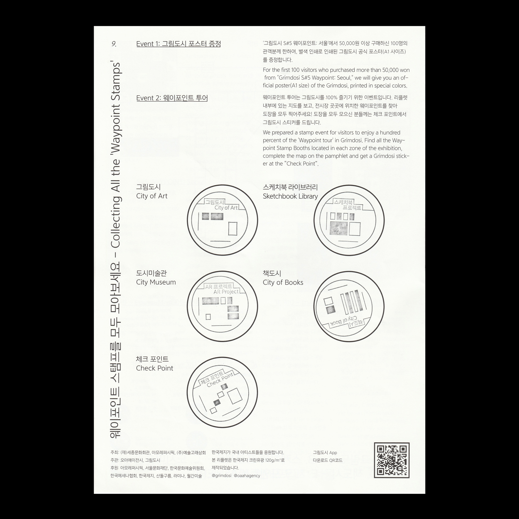
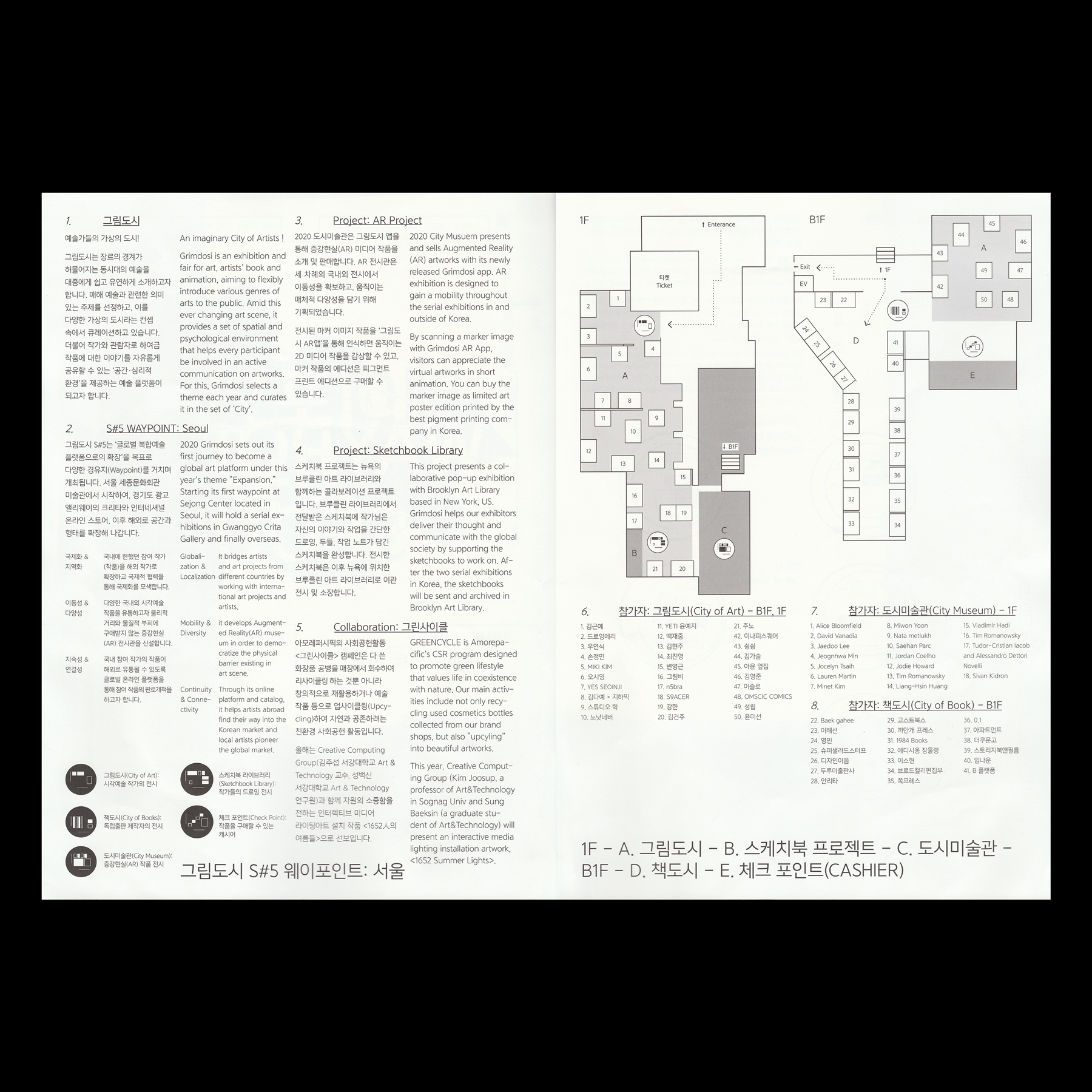
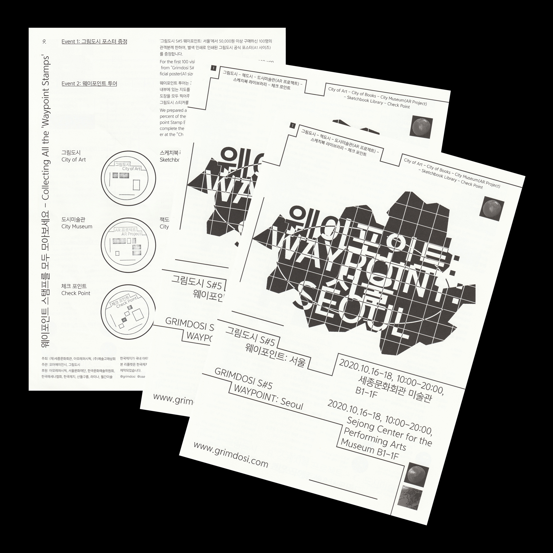
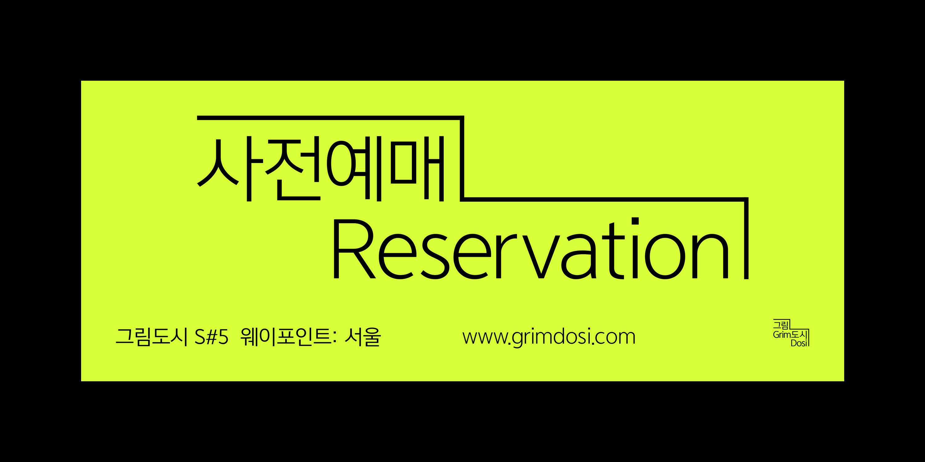
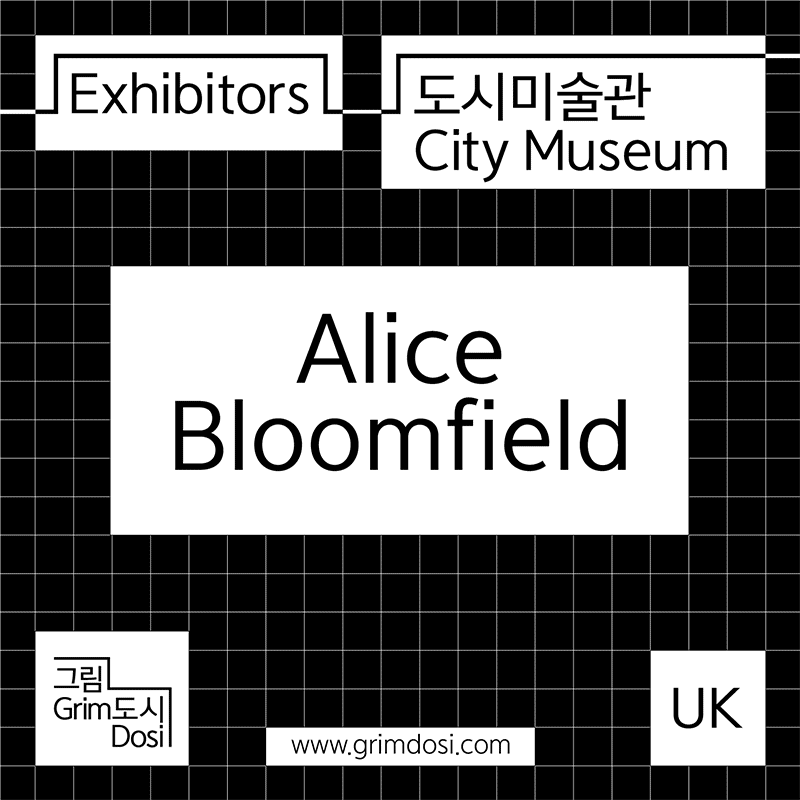
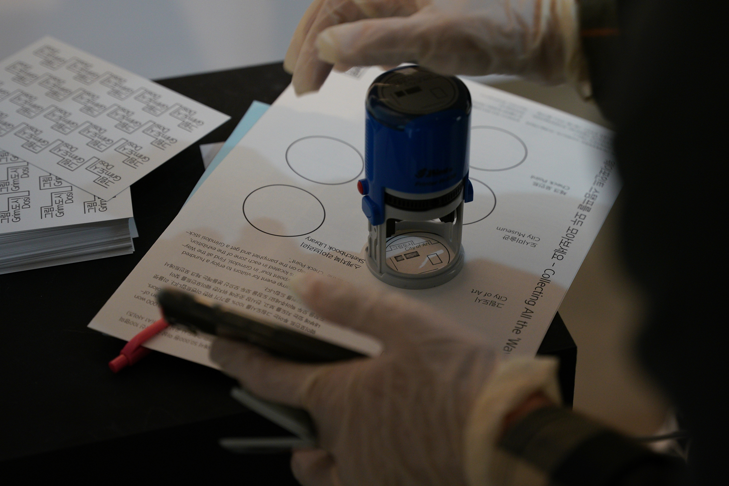
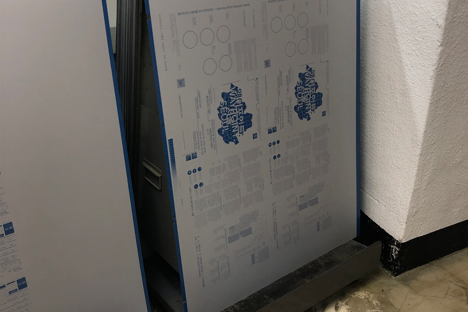
Ticket, Handout, Postcard / Dimensions Variable
For making handout, I had a lot of text for it. So, the i mainly focus on how can i organize all of information of exhibition and how use the identity. But at the same time, I need to put some area for ‘Stamps’. The main graphic used for the poster was placed on the front of the handout, and each section of information was clearly divided in the inner page to enhance readability.

Applications︎︎︎
Web Banners / Dimensions Variable

Applications︎︎︎
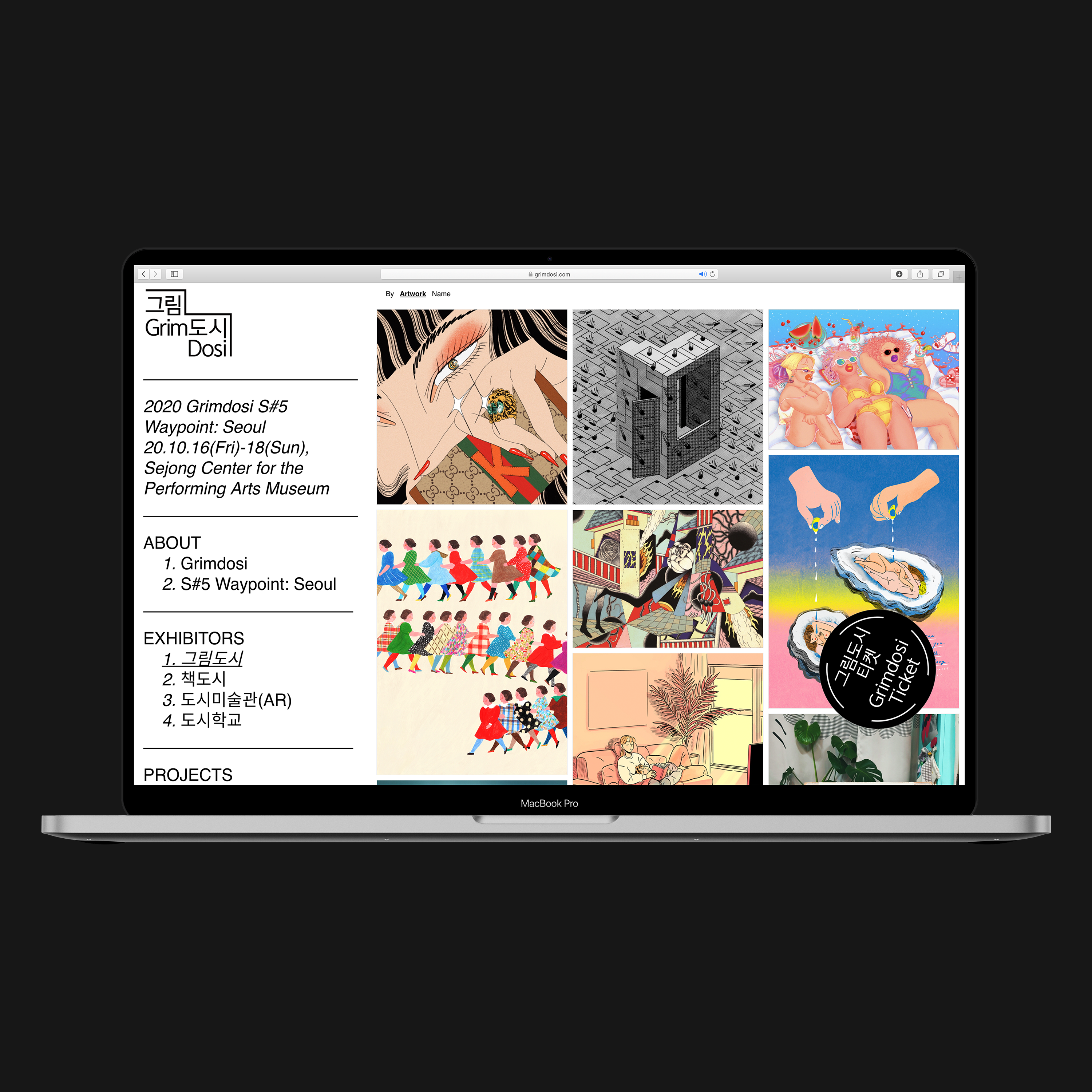
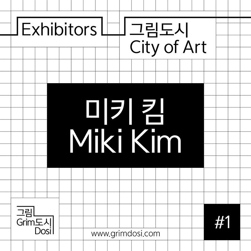
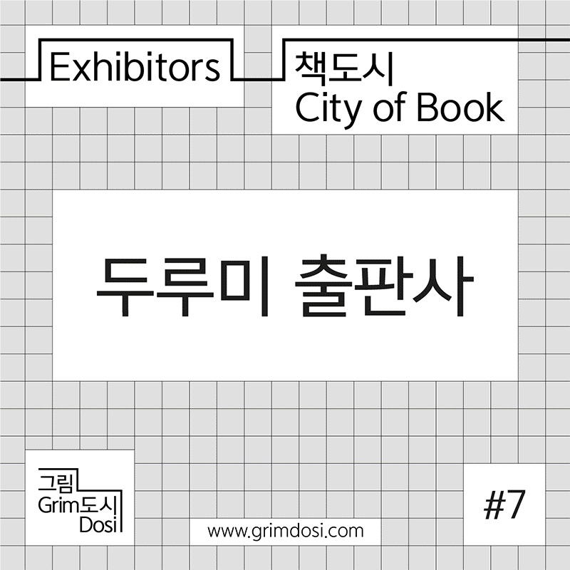
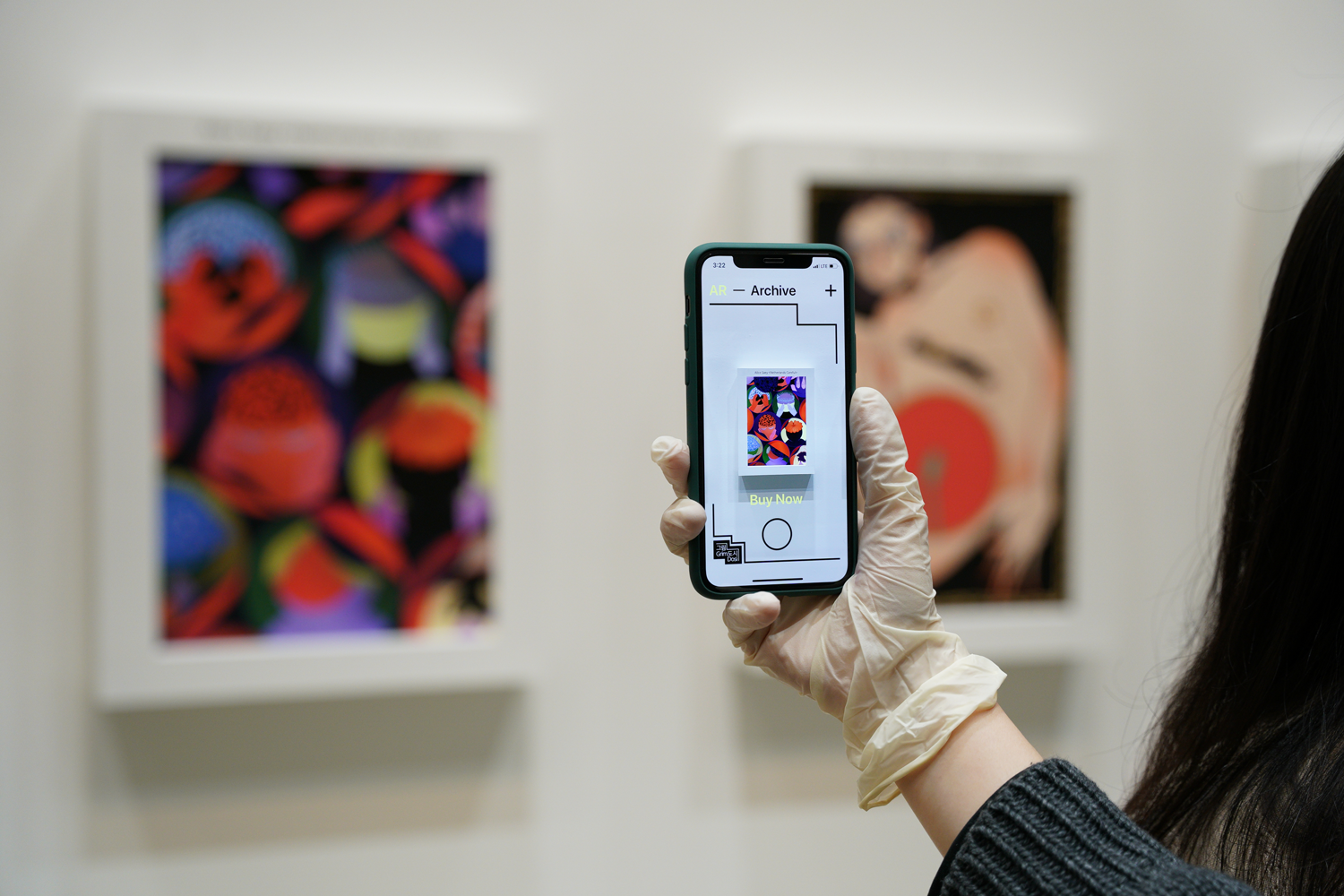
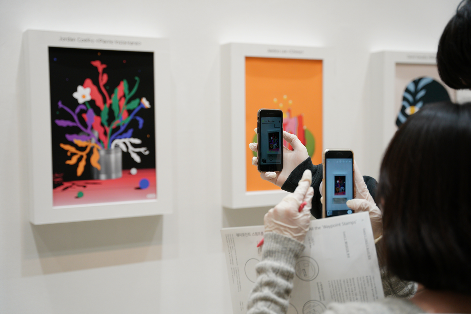
Website, AR App, SNS / Dimensions Variable

Applications︎︎︎
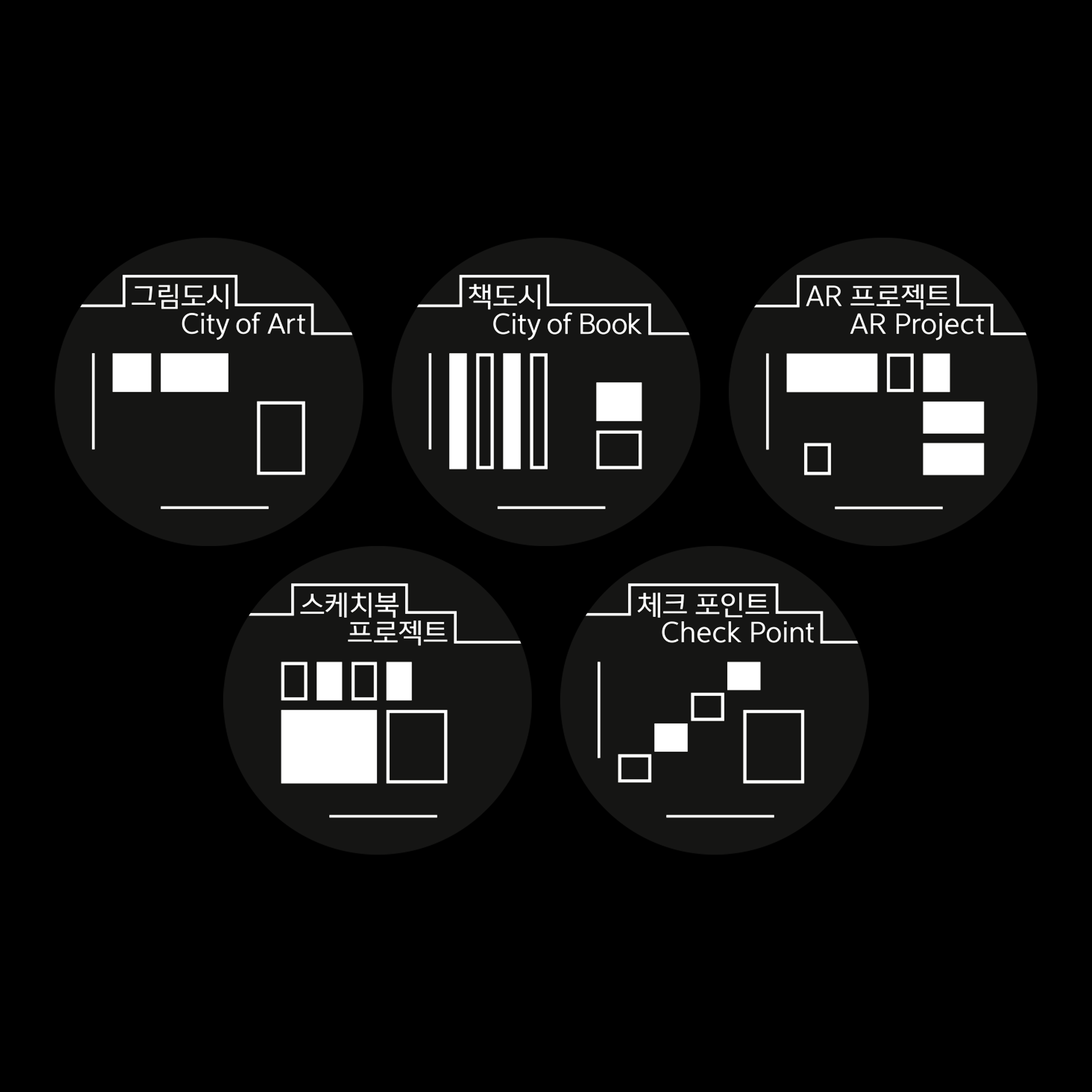
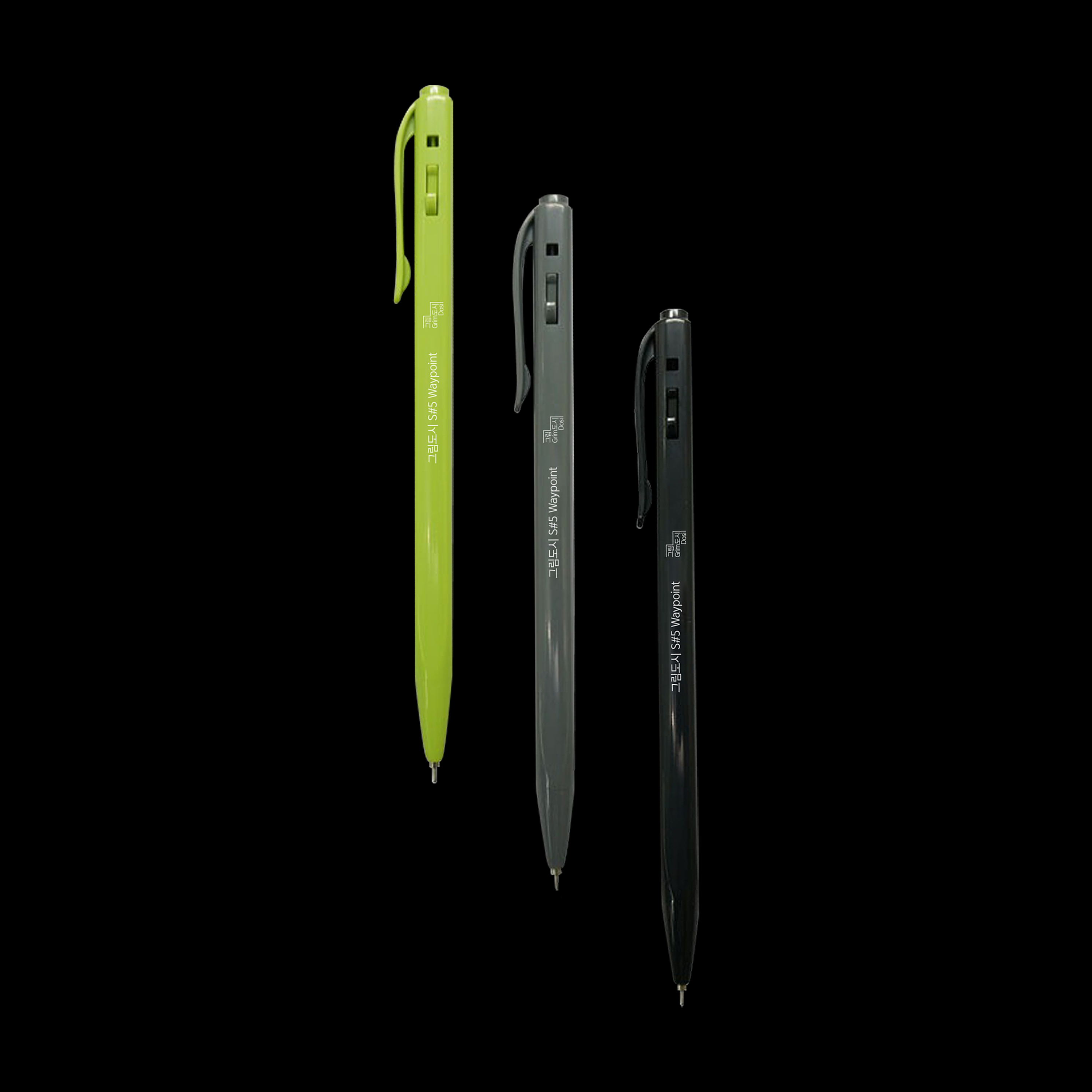
Stamps, Pen / Dimensions Variable

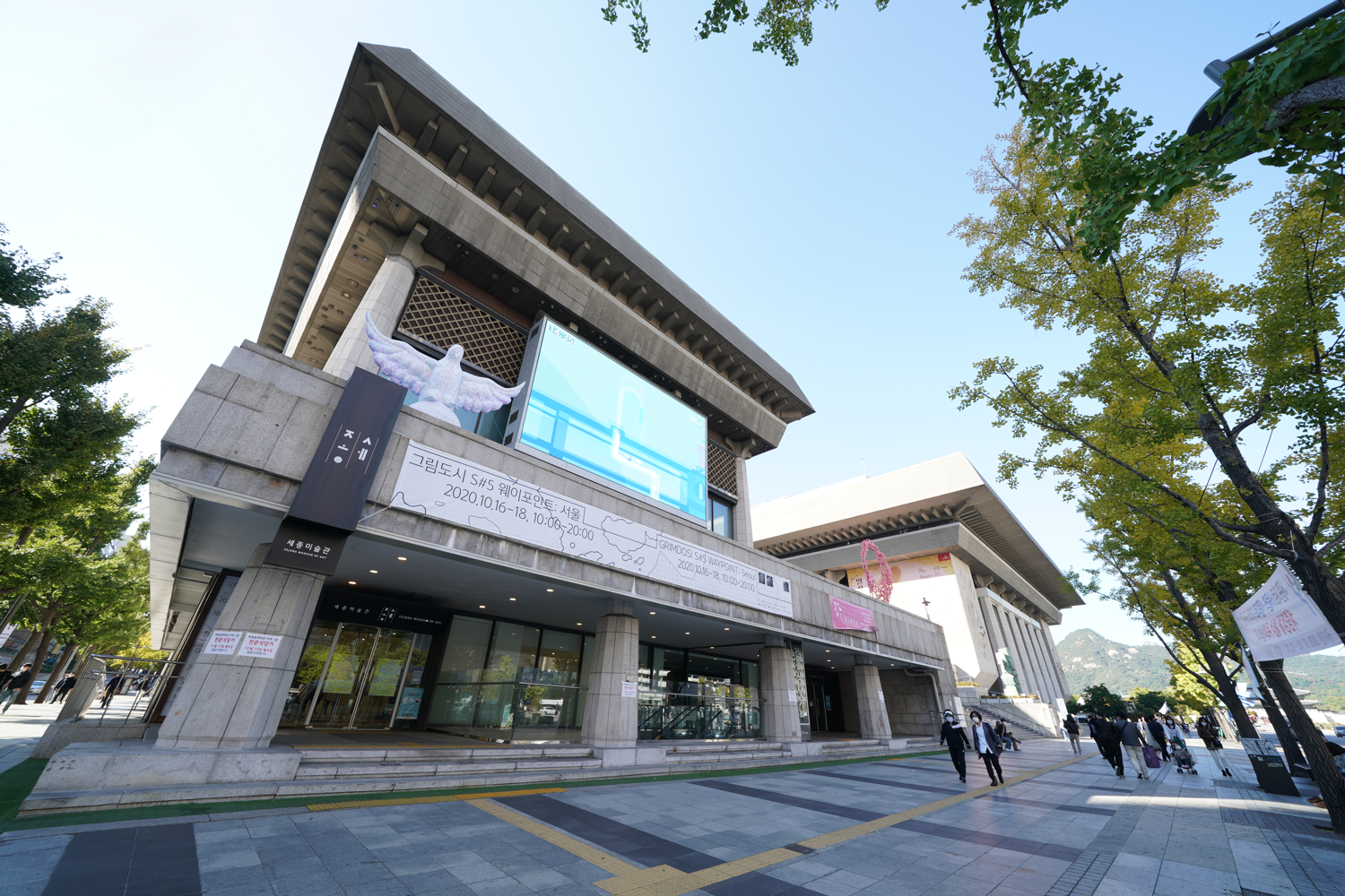


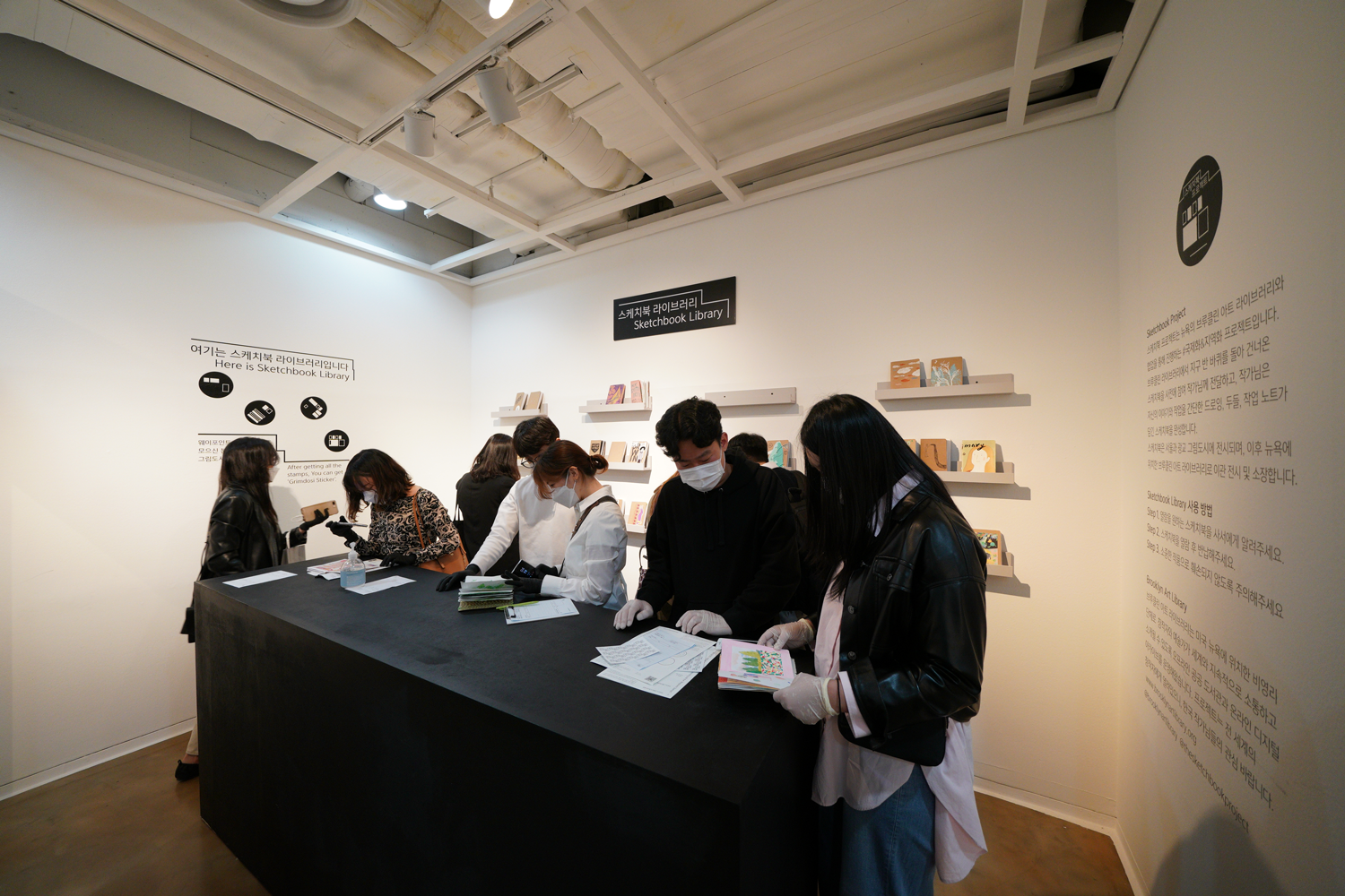
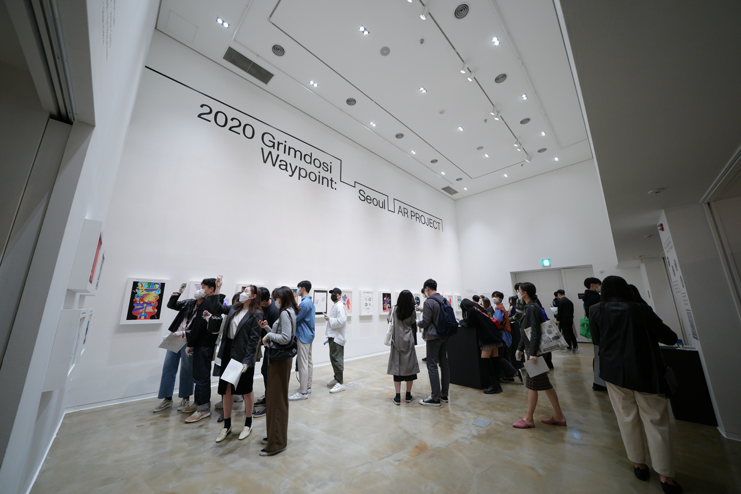
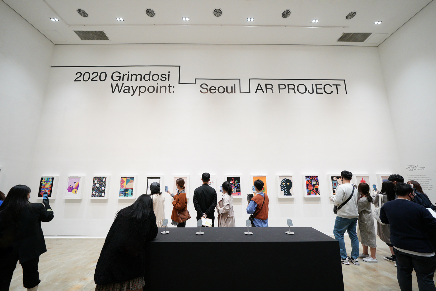

Exhibition Sketches︎︎︎
ⓒ Oaah Agency

Photography by SDYP︎︎︎
© Oaah Agency
︎︎︎ Visit to Exhibition Official Website