Selected-made Furniture Projcet
Taxa, 2021
Work Area: Branding, Web, SNS, etc.
Client: SL Design
Logotype︎︎︎
2000 × 2000px
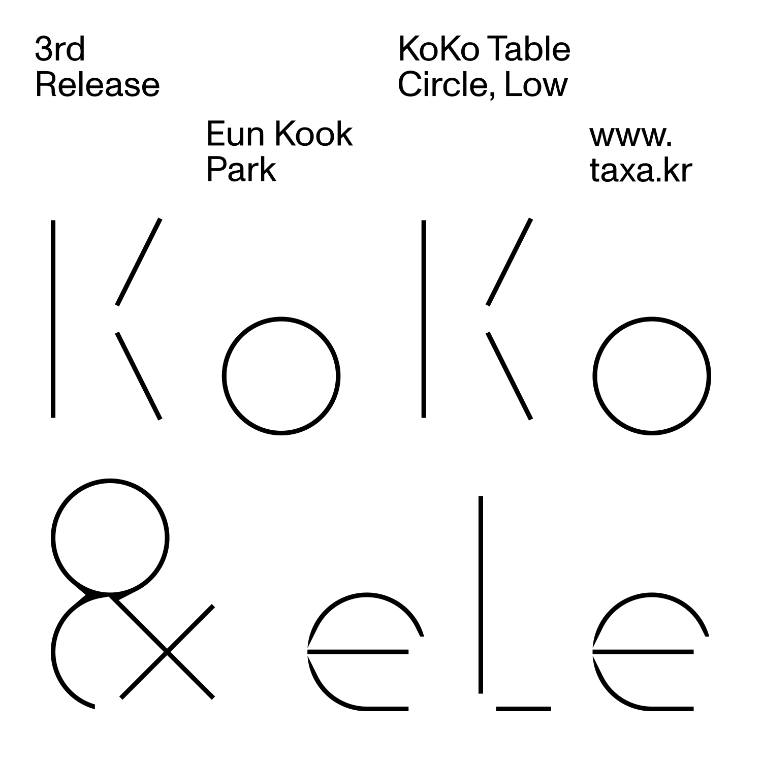
‘Taxa’ is a brand that selects, manufactures and introduces the artist’s furniture. Starting with furniture, ‘Taxa’ have a plan to present a variety of objects connected to the space. The brand started with the first release of KoKo Table and eLe Chair by artist, Park Eun-kook.
In the early stages of the branding, I asked, 'What kind of furniture does ‘Taxa’ want to deal with? In the mass-produced furniture market, they wanted to make furniture that could be used continuously in our life even if made a single piece of furniture. So, based on long conversation, I set three keywords: 'calm, strong, and breathe'.
Then, by chance, I discovered a plant which is 'Alisma canaliculatum(It is called 'Taxa' in Korean pronunciation)'. Taxa is a small plant that grows in rice fields in Korea. Although it is small in size and has a rustic appearance, it is used medicinally. I felt that the plant was very similar to the image pursued by this brand & furniture. Like a taxa that fulfills its purpose without being flashy, The furniture that will remain silently but firmly in one corner of our space.
Appications︎︎︎
Logo Grid (Light to Bold)
To build a brand identity, I consider two aspects. First, considering that it is a furniture brand, I wanted to give a geometric impression. So, the letters are made as if the roots were sticking out in a grid (soil) of a certain size (It actually looks a bit like farmers farming). And just as the plant gets thinner and thicker as the seasons change, the logo can also be changed to light and bold versions. Also, plants do not grow to the same height. Therefore, only 'T' was written in capital letters to make a difference in height from the rest of the letters, and 'x' was made slightly higher than the other two 'a's, so that the logo was made to have an uneven overall height like a plant.
Applications︎︎︎
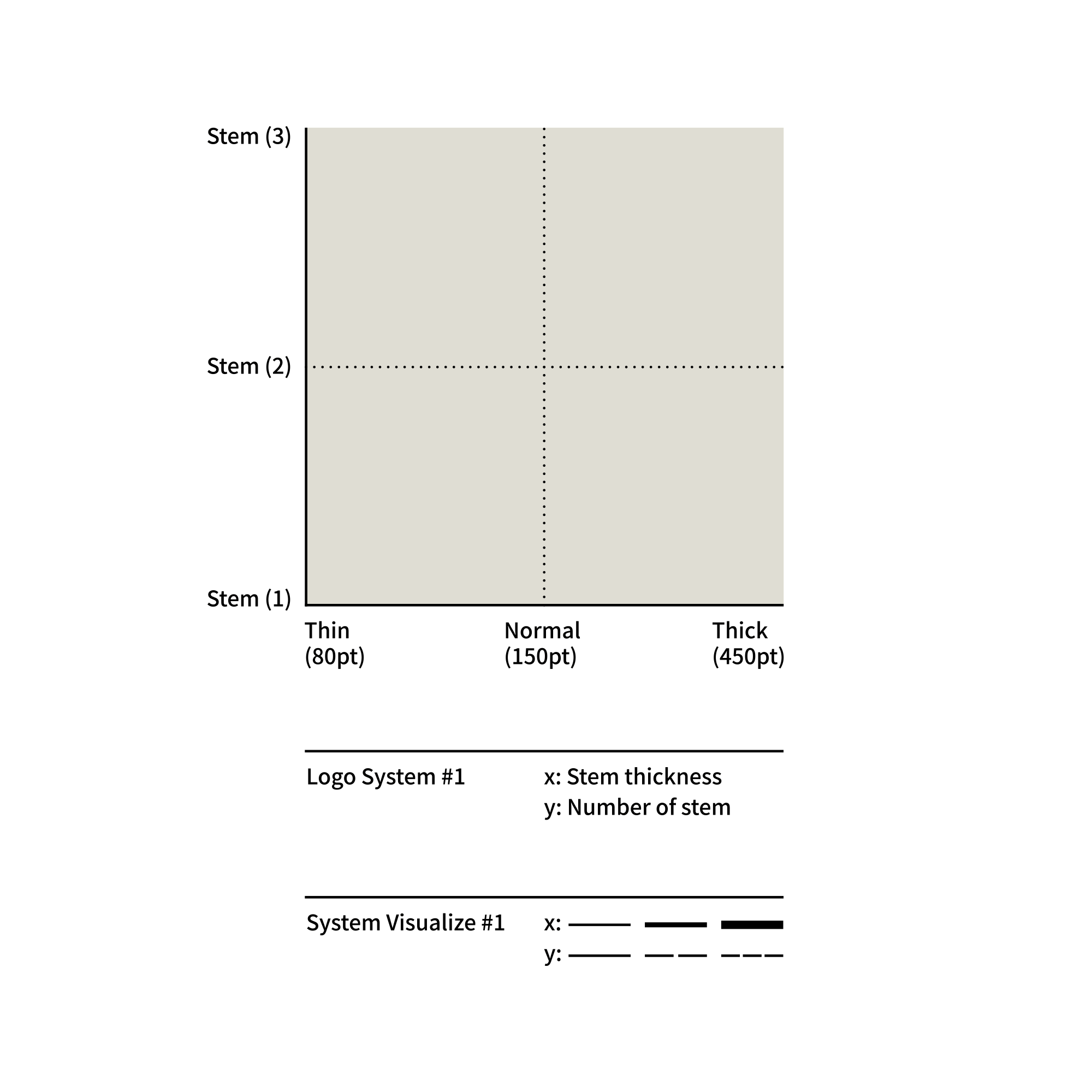
Identity System
In the second aspect, the logo variation system was built based on the growing stems of plants. It is a system based on how many stems are segmented (minimum 1, maximum 3), how thick the stem becomes, and the direction in which it grows (horizontal and vertical). An infinite number of variations can be created in the system. The images above are some examples of them.
Applications︎︎︎
Logotype Motion, 2000 × 2000px
Applications︎︎︎
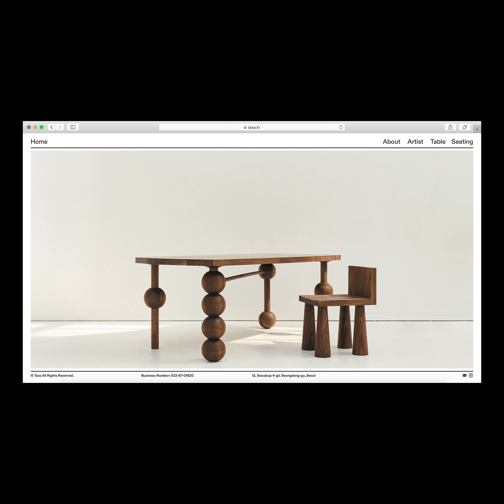
Official Website (Desktop, Mobile)
Applications︎︎︎
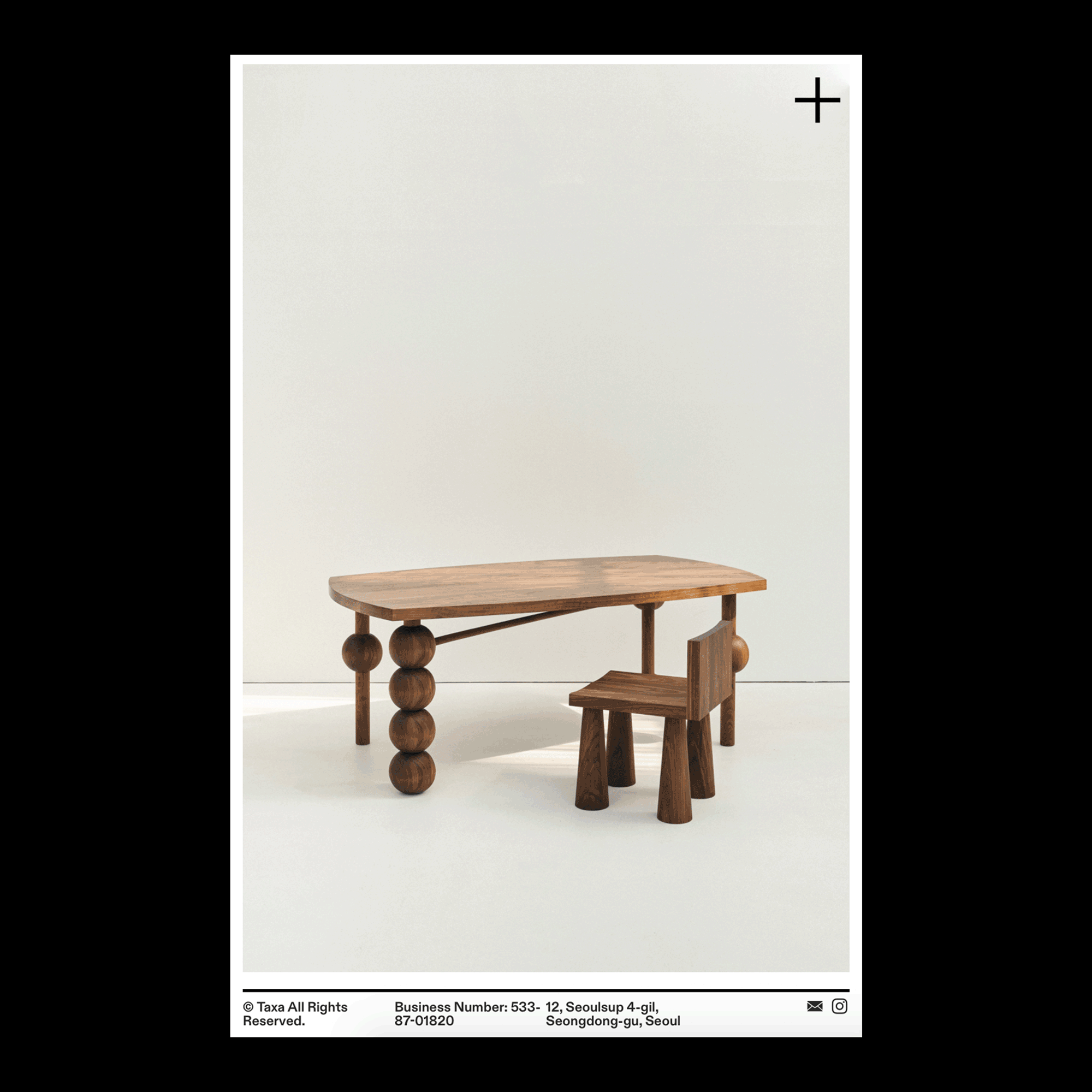
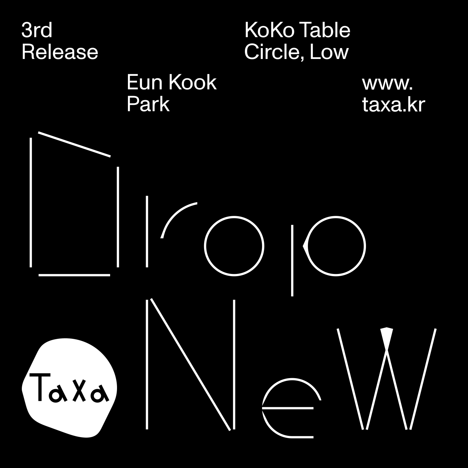
Instagram Images
Applicaitons︎︎︎
Instagram Images
︎︎︎ Visit to Taxa Official Website