Professional Basketball Training
STANCE, 2021
Work Area: Logotype
Client: STANCE
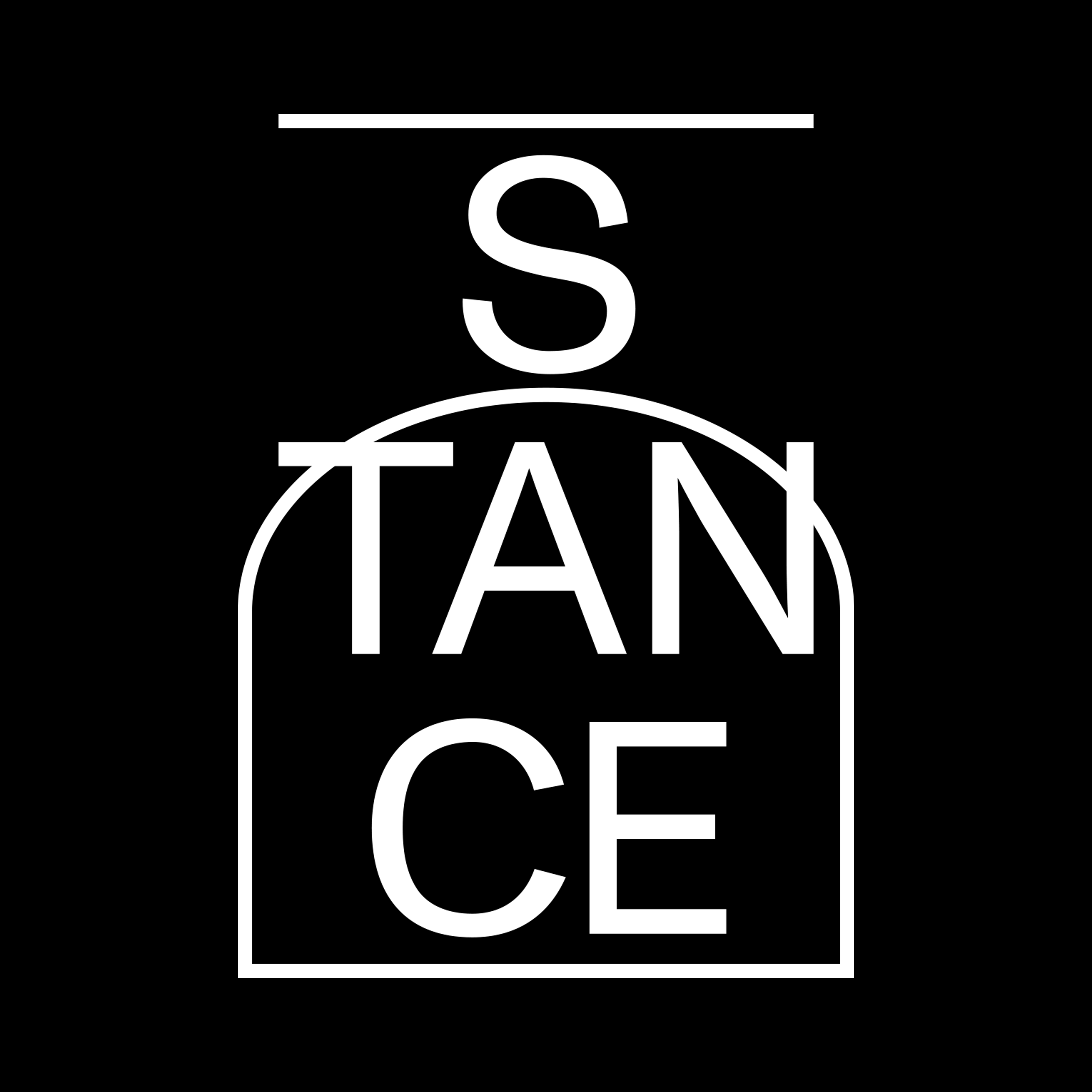

Logotype ︎︎︎
5000 × 5000px
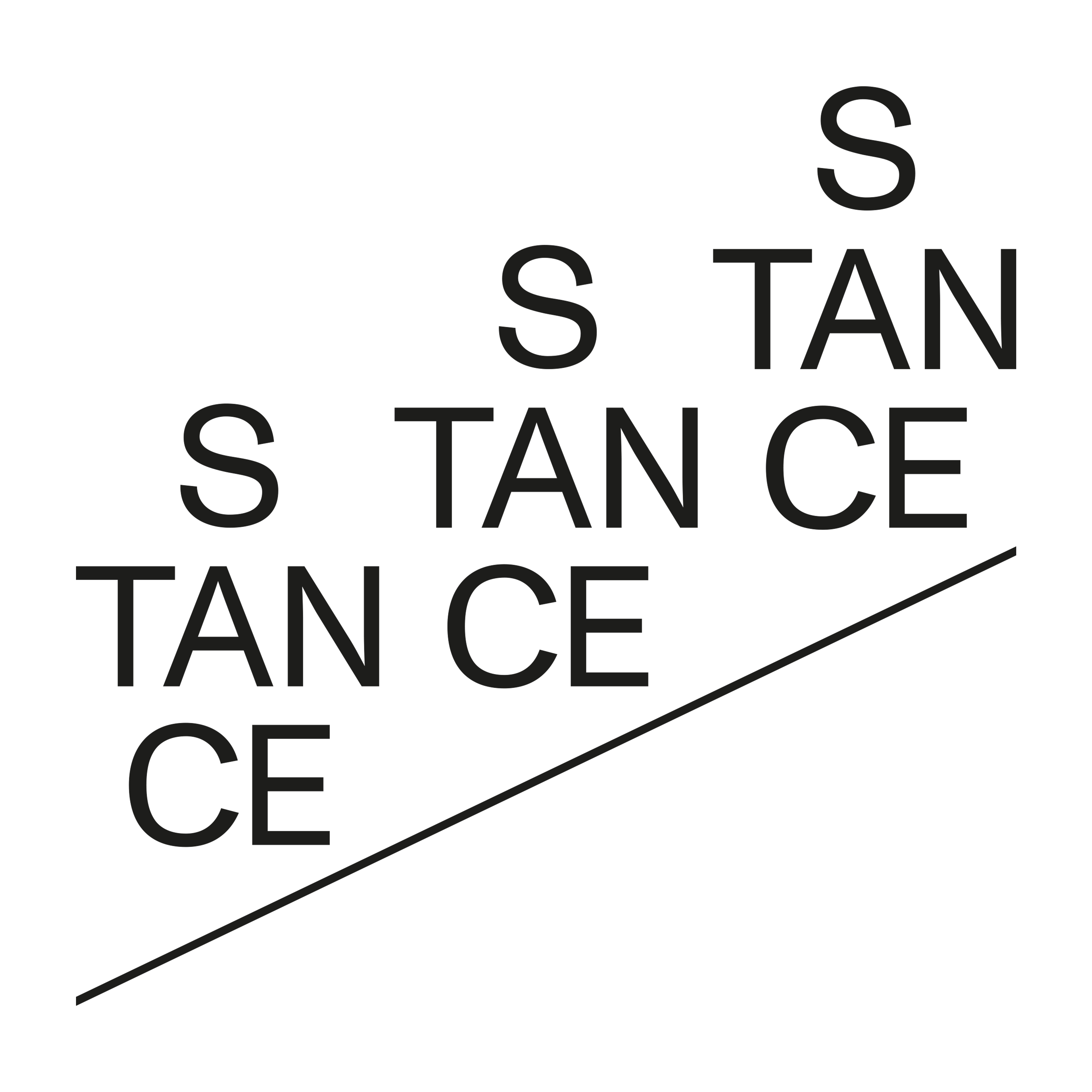
STANCE is the business based on basketball. When I started this work, I wanted the logo to look like a basketball player. I decided to align it vertically because of the tall feeling that comes to mind when thinking of a basketball player.
And considering that STANCE is an education-based business, I extracted the keyword 'bond, connection' between the instructor and the students. For this, I gathered some ‘lines’ in baksetball from play court, rule, foramtion, streadgy something like that.
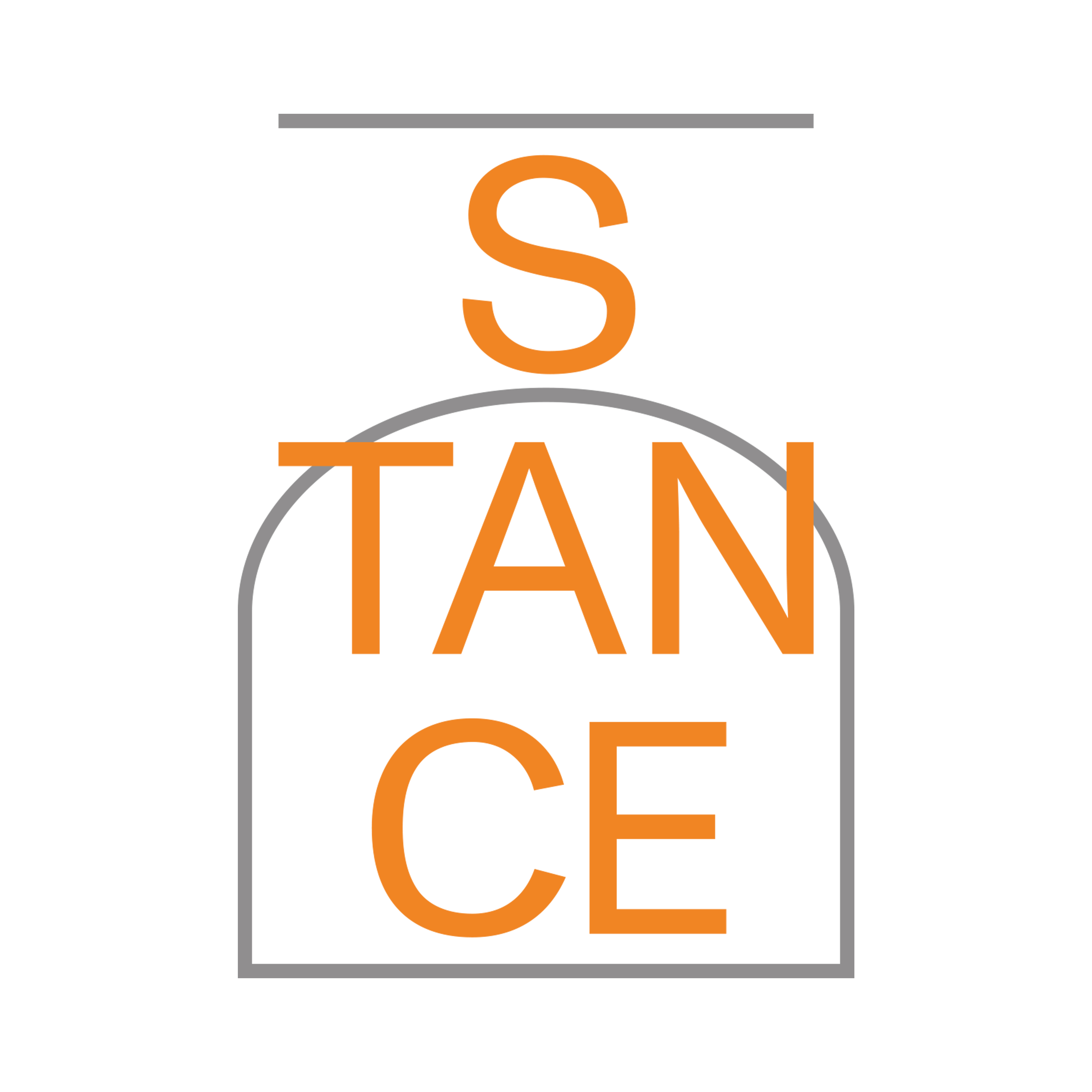
Logo Standard ︎︎︎
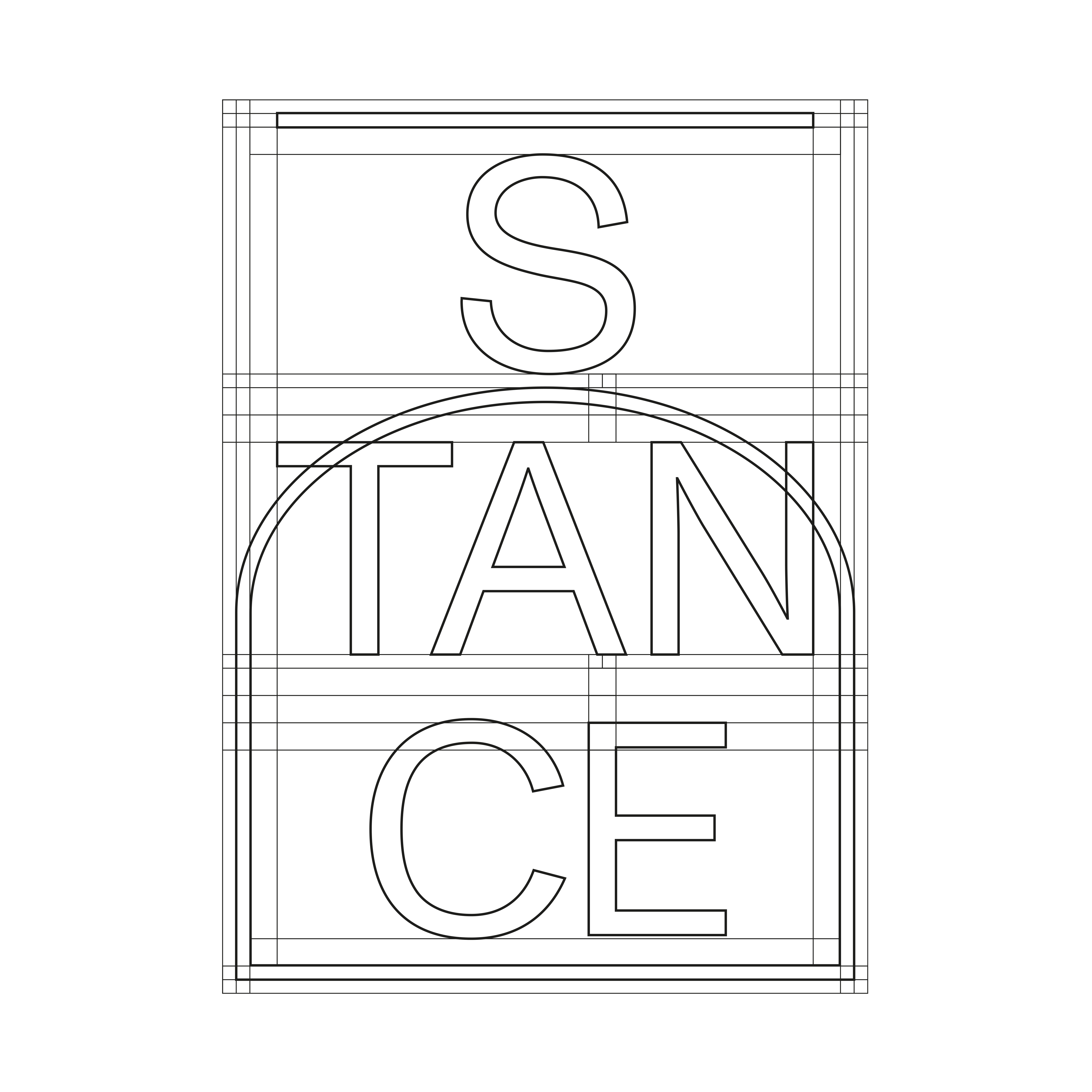
Logo Variation ︎︎︎
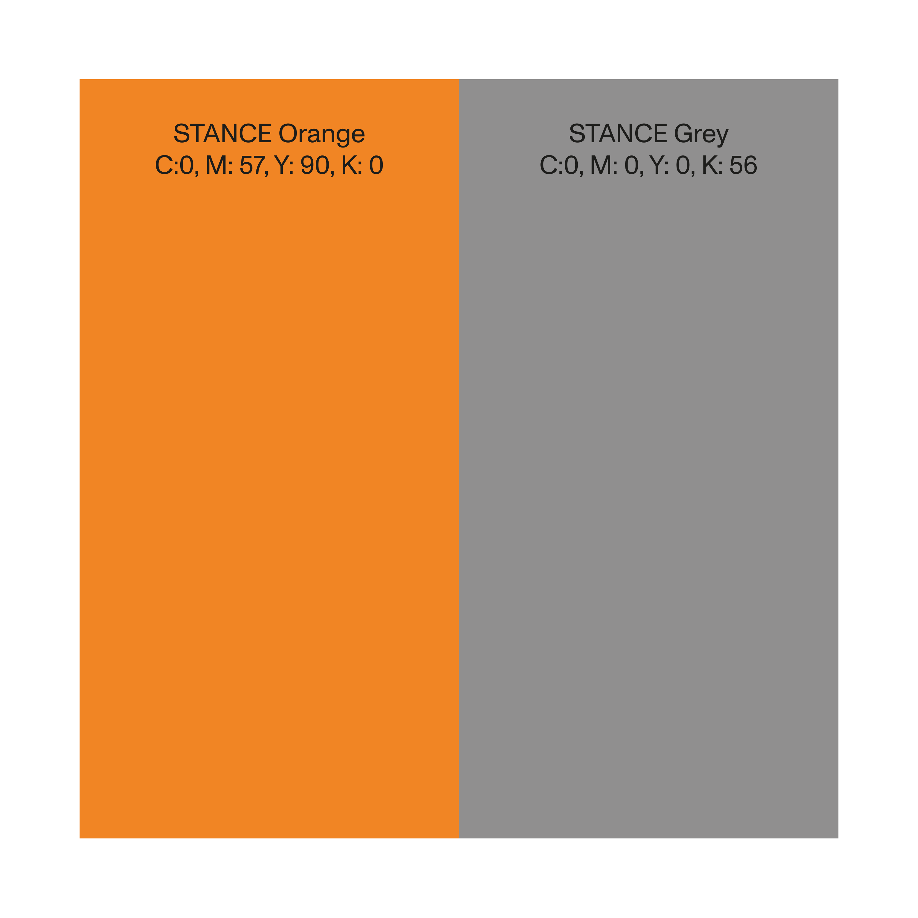
The main color of 'STANCE Orange' was selected from the activeness of the sport, basketball. Afterwards, ‘STANCE Grey’ was added to give it a refined feel.
One of the line I gathered is ‘Turn Stance’ which is the player stand diagonally. The logo is created repeatedly along the diagonal. From this we can imagine that a variation logo could be created using different lines present in basketball.

Business Card ︎︎︎
90 × 50mm
︎︎︎ Visit to STNACE Official Instagram